Overstock · Product Design Systems & Accessibility
Governing a Design System Across 20+ Product Teams
I helped maintain and evolve Overstock’s web and mobile design system, then led accessibility prioritization across its web properties.
- Starting Point
- Teams responsible for different parts of the shopping journey needed a common way to make interface decisions.
- Design Decision
- Make shared patterns easy to reuse and give teams guidance they can apply in context.
- System Reach
- More than 20 product teams used the web and mobile design system.
- My Contribution
- Shared pattern governance, design documentation, and mentoring. As Director of Strategic Initiatives, I led WCAG prioritization and remediation planning.
- People Involved
- Product designers, Engineering, Product, and Brand
In This Case
Help Teams Make Shared Decisions
Shopping, navigation, and checkout each had different needs, but customers experienced them as one store. The web and mobile design system gave teams a shared set of patterns across those parts of the journey. I helped maintain the system, improve how patterns were documented, and mentor designers as they applied them.
The recurring decision was what belonged in the shared system and what a team needed to handle in its own flow. My role was to help teams start from an existing pattern, talk through where it fell short, and work with Design and Engineering on guidance others could reuse.
From a Local Need to Shared Guidance
Start With the Pattern
Identify what the shared pattern already supports and where the current task asks for something different.
Evaluate It in Context
Bring the flow to Design and Engineering. Discuss the interaction, implementation, and accessibility implications.
Explain What Carries Forward
Document the reusable decision and give the next team an example it can apply.
Review a Pattern in Context
Consider a gift card field at checkout. The two storefronts can use the same field and error behavior while presenting their own brand and explaining what customers need to do with their card. That distinction gives Engineering one interaction to maintain and gives each storefront room to explain its own rules.
I’d review the whole recovery path with Engineering. Can someone reach the field by keyboard, understand what failed, and try again on a narrow screen? When another team needs the same interaction, the documentation should include those states and explain where the team supplies its own copy.
An illustrative pattern review using gift card redemption as the scenario.
Show How the Parts Fit
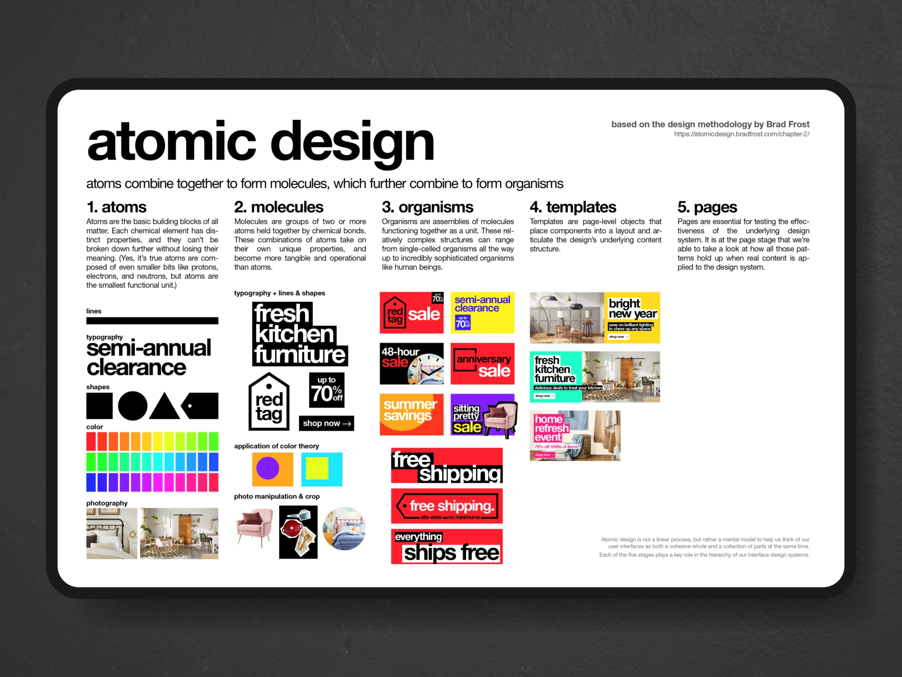
I used Atomic Design to explain reuse in the retail brand work as well. The campaign board above makes the idea visible. Type, color, and photography combine into repeatable headline and offer treatments. Those treatments fit into different campaign layouts while still looking like work from the same store.
Take the Red Tag Sale example. A recognizable tag, a short headline, and a discount callout can be combined into a compact offer. The wider campaign layouts show how the same hierarchy can sit beside photography. That gives a designer a starting point for a new format and a way to check whether the offer still reads quickly when the available space changes.
That board documents the retail creative system. The web and mobile product system served a different purpose, giving product teams a shared vocabulary for interface patterns. The lesson that carried between them was to show how the pieces work together with real content. A team can do more with a worked example than with a list of ingredients.
Make Accessibility Practical
As Director of Strategic Initiatives, I led work to help teams understand WCAG issues, prioritize fixes, and plan remediation across Overstock web properties. I also mentored designers on applying accessible patterns in their own work. The aim was to give each team something specific it could act on in the interface it owned.
Give People a Reference They Can Use
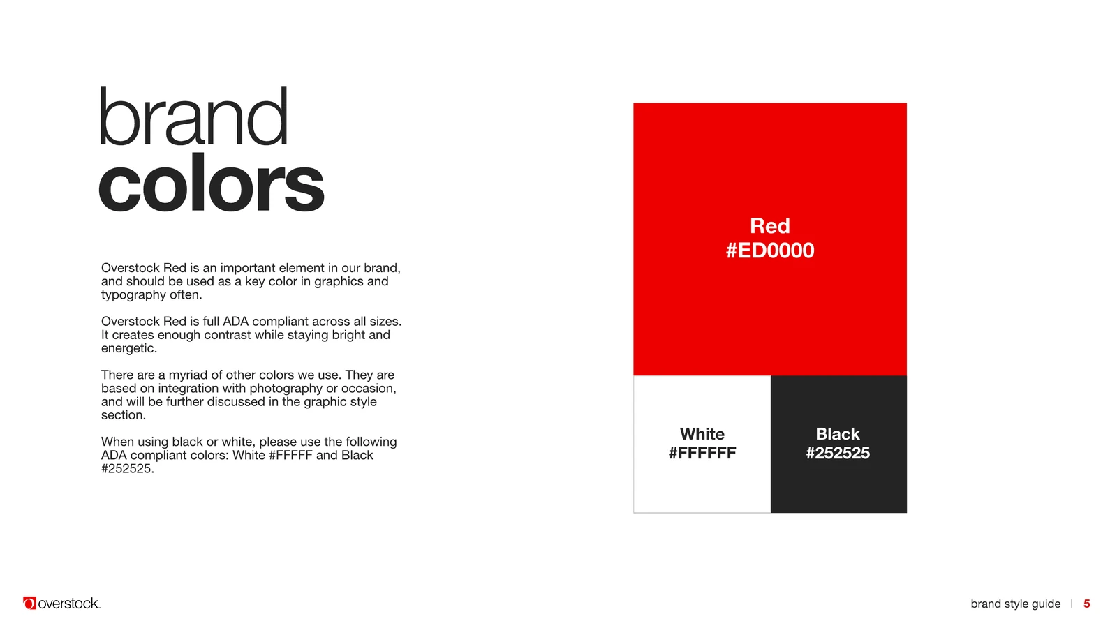
In my later Brand Standards & Design role, I led the update to the brand guide and built a SharePoint hub for the guide, current assets, templates, and customer research. Teams could find the approved materials and use them in routine work. I also built templates with instructions and trained employees to use them.
“One of Beau’s greatest strengths is his ability to deliver solutions that combine his ideas while achieving the goals of his stakeholders. The best example of this is his work on the company’s style guide.”
The product system’s reach and the brand guide are different kinds of evidence. More than 20 product teams used the web and mobile system. The guide and asset hub show how I made standards available to the people applying them. In both cases, I wanted teams to be able to make the next routine decision with confidence.