Overstock / Bed Bath & Beyond · Ecommerce Program Design
Customer Retention and Incentive Programs
I was part of the team that brought back Overstock’s gift card program and later its Trade program. I oversaw design and helped establish how each program worked, then guided both through the move to Bed Bath & Beyond.
- Starting Point
- Two discontinued programs needed to be rebuilt under Overstock before either could move to the new storefront.
- My Contribution
- Oversaw design and the development of program rules and structure with the teams responsible for putting them into practice.
- What Changed
- Gift cards and Trade returned under Overstock. We then carried both into Bed Bath & Beyond with updated materials and customer guidance.
- My Role
- Senior Manager of Brand Standards & Design. Led design for gift cards and Trade and oversaw their brand transition.
- People Involved
- Trade, Product, ecommerce, and print production partners
In This Case
Bring the Programs Back Under Overstock
Gift cards and Trade served different customers. Gift cards gave someone a way to buy for another person and gave the recipient a reason to visit the store. Trade gave interior designers and other professionals a reason to return when they were sourcing for projects. We revived gift cards first, then Trade.
I oversaw design and worked with the teams to establish the rules and structure people would encounter. For gift cards, that meant defining how a physical card would be recognized, activated, and redeemed. For Trade, it meant making the offer clear, including who it was for, what members got, and how to join.
Make Gift Cards Work From Print to Checkout
When we revived Overstock’s gift card program, the design had to work for the person choosing the gift, the recipient redeeming it, and the teams producing and supporting it. I led the card and packaging design and worked with Product and our print partners to connect the physical card to activation, redemption, and tracking online.
Give Each Side of the Card a Job
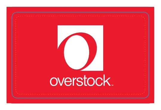
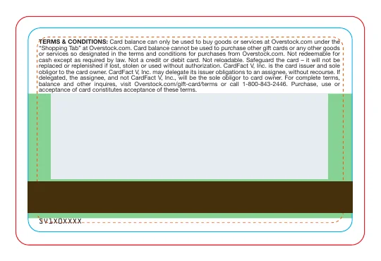
The front had to make the retailer recognizable at a glance. The back had to fit the redemption terms and leave room for the production elements, including the account number, barcode, and magnetic stripe. The vendor proof made those constraints visible before printing.
Review the Terms Alongside the Physical Proof
Two archived proofs show a small but important copy choice. One mentions the Shopping Tab. The other refers to shopping on Overstock.com more generally. That difference changes what a recipient looks for when redeeming the card. The proofs show both versions under review.


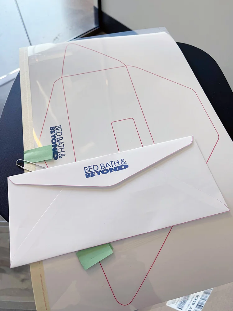
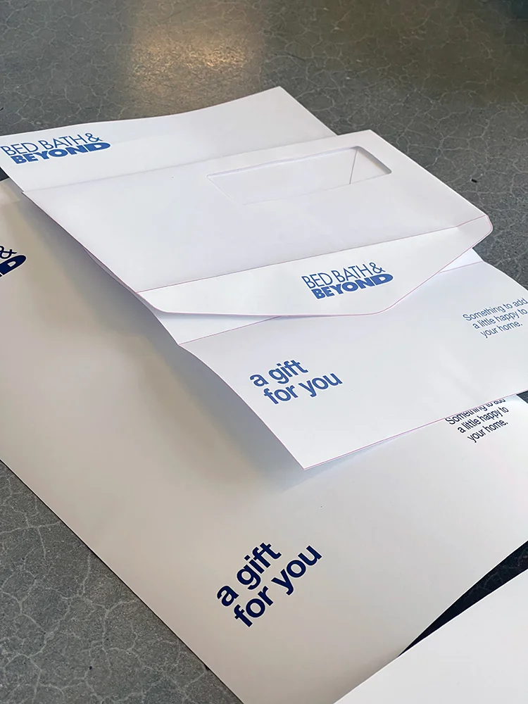
I worked with print vendors on materials, folds, and color proofing. The unfolded proof showed how the design lined up with the folds. The assembled proof showed what the recipient would see first and how the greeting read with the logo.
Carry the Same Program Into a New Retail Identity
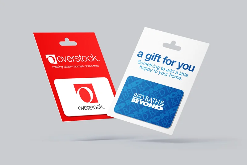
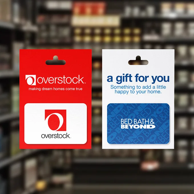
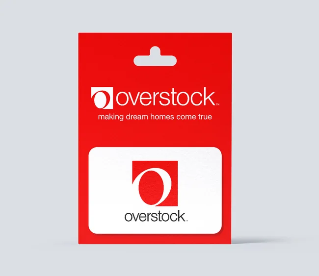
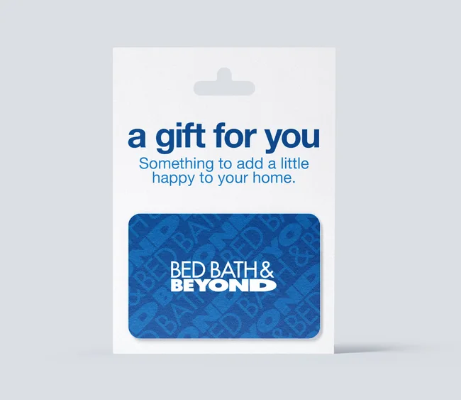
The two carrier designs put the brand in different places. Overstock uses its red background and wordmark to establish the retailer immediately. Bed Bath & Beyond opens with a gift message, with its name carried on the patterned blue card. The product format stayed recognizable through the visual change.
Recognize the Retailer
The card and carrier identify the store before the gift is opened.
Activate the Card
The production proof leaves room for the credentials the activation process needs.
Redeem Online
The terms point the recipient to the store and set expectations for using the balance.
That’s the part of the program I wanted to protect through the rebrand. The storefront and packaging could change, while the card still needed a clear path from purchase to redemption.
Make the Trade Offer Clear
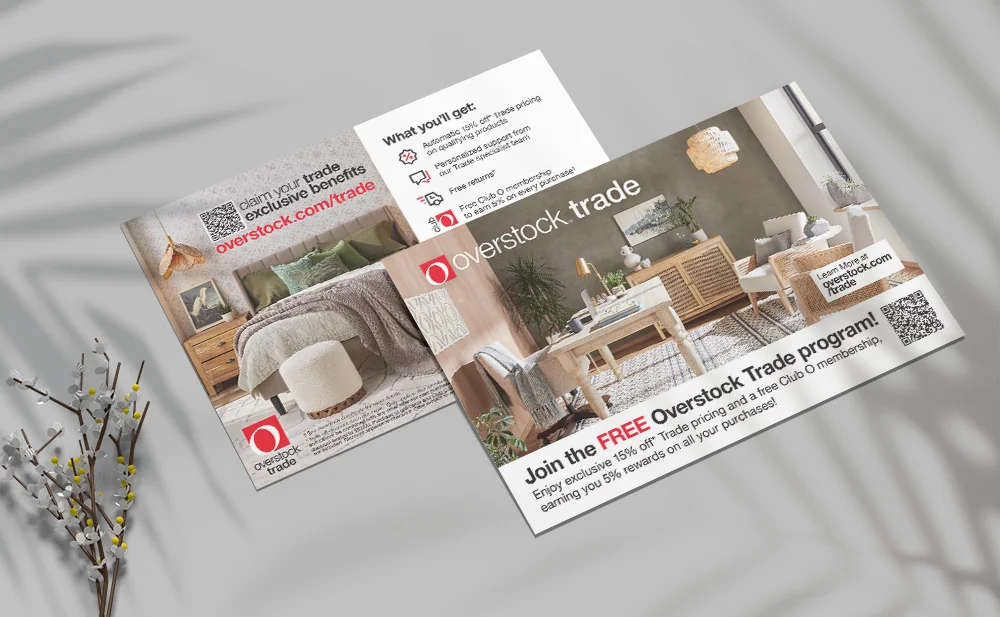
Trade needed a proposition that made sense to professionals who buy repeatedly. I worked with the Trade team on the program’s structure and how we communicated it. The offer brought together trade pricing, specialist support, and rewards. The work was to make those benefits easy to understand and give interested professionals a clear next step.
I developed standards for how the program appeared in print, digital advertising, and events. The Overstock postcard did several jobs in a small space. It introduced the program, summarized the benefits, and gave readers a direct path to learn more and join.
Carry Both Programs Into Bed Bath & Beyond
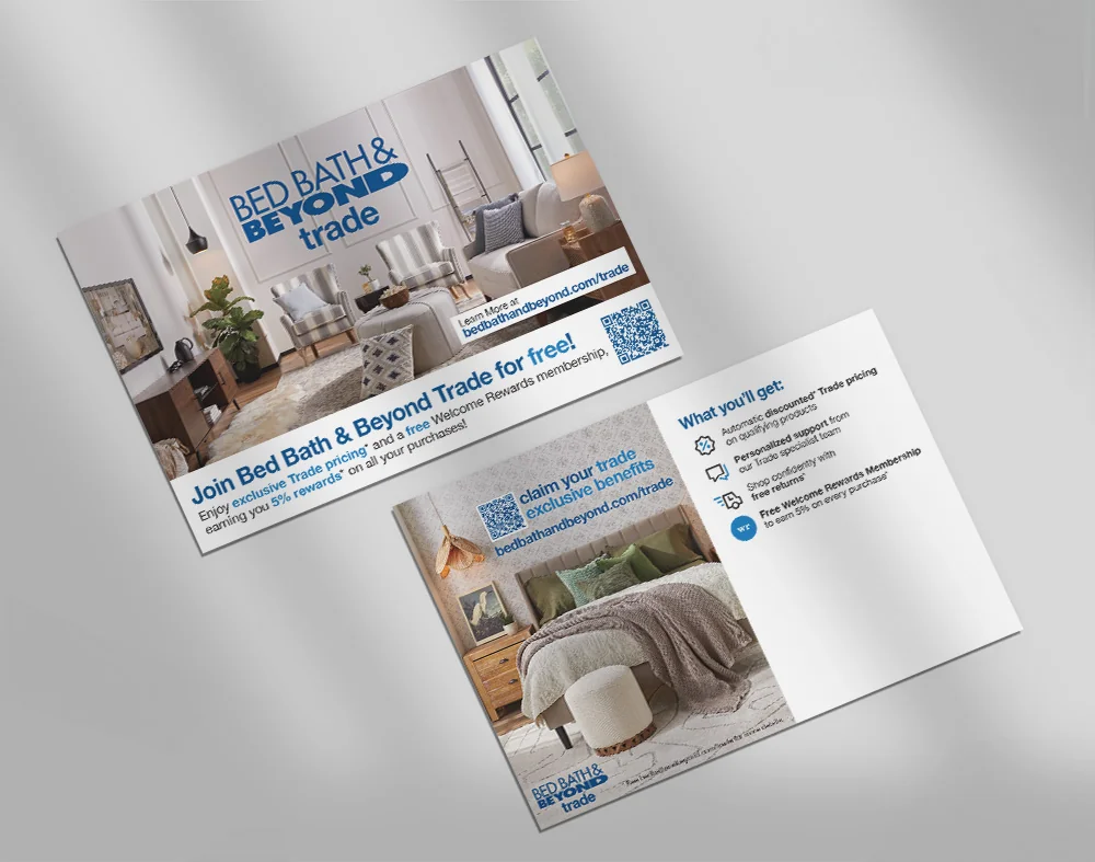
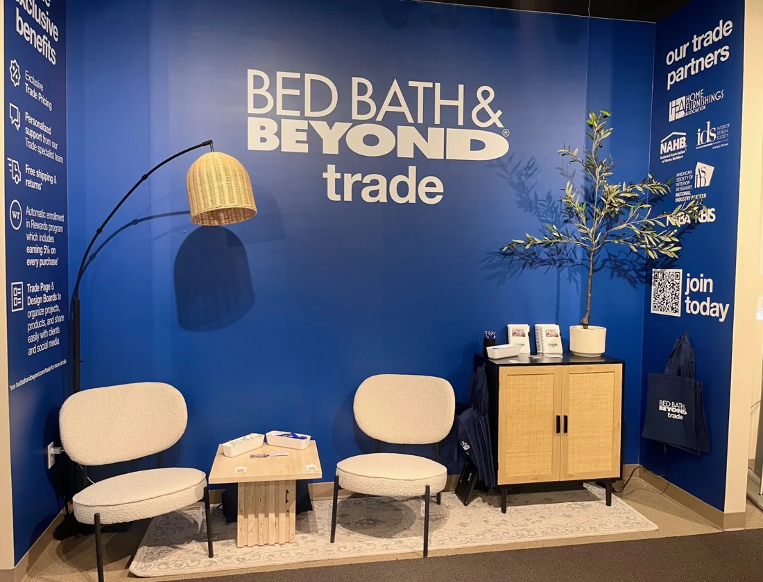
When Overstock.com became Bed Bath & Beyond, I oversaw the design switch for both programs. For gift cards, a customer with an active Overstock balance needed to know it would still be honored on the new site. The redesigned Bed Bath & Beyond card kept the familiar blue and used a repeating logo pattern to distinguish it from the earlier version.
For Trade, I carried the offer and sign-up path into the new retail identity. The Bed Bath & Beyond postcard kept the program recognizable while updating the storefront, imagery, and rewards language. At Las Vegas Market, we used the booth to introduce the same offer at a distance and give visitors a way to talk with the team or join on the spot.
What the Teams Could Carry Forward
The relaunch produced two programs teams could put into use under Overstock and carry into Bed Bath & Beyond. Gift cards connected print production to activation and online redemption. Trade had a clear offer and materials the team could adapt from a postcard to a trade show booth. My contribution was to connect the rules behind each program to the experience customers actually encountered.