Overstock / Beyond · Shareholder & Employee Experience
Guiding Teams Through Rebranding
I guided how employees and shareholders experienced the brand change. As leadership’s direction shifted, I translated each decision into communications, standards, and tools people could use.
- Starting Point
- Overstock was both the company name and the retail brand. The guides, files, and templates all reflected that.
- My Approach
- Use the SharePoint hub, updated guidance, and ready-to-use materials to show teams which identity applied at each stage.
- What Teams Could Do
- Find the current assets, use the right identity for the audience, and prepare communications from a shared reference.
- My Role
- Senior Manager of Brand Standards & Design. Led brand and shareholder design through the transition.
- People Involved
- Executive leadership, Investor Relations, Brand, Legal, HR, and agency partners
In This Case
How the Brand Changed
Before the Acquisition
Overstock Was the Brand
One name anchored the company and the storefront.
Summer 2023
Bed Bath & Beyond Became the Storefront
The retail site switched to the acquired brand and the Overstock.com storefront was sunset.
November 2023
Beyond Became the Parent Company
The corporate identity and NYSE listing changed while the retail brand stayed in place.
March 2024
Overstock Returned
Overstock.com returned as a separate storefront alongside Bed Bath & Beyond.
Give Employees a Place to Check What’s Current
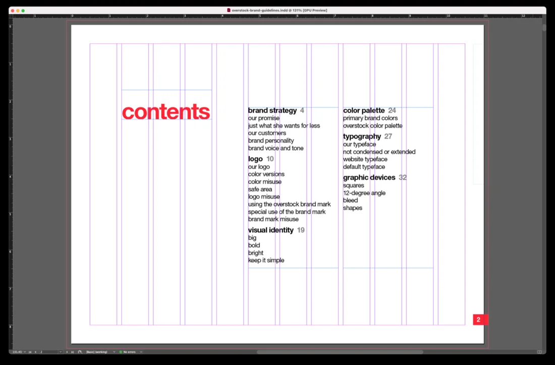
When Overstock was still the company and the storefront, I led an update to the brand standards. I audited the materials, gathered input from the people who used them, and documented how the identity worked across real communications. I built a SharePoint hub for the guide, current assets, and templates.
At each change in direction, I updated those tools so employees had a place to check which identity applied and materials they could put to work. I built instructions into templates and trained employees to use them. Teams could produce routine work independently and bring sensitive or high-visibility communications in for review.
“One of Beau’s greatest strengths is his ability to deliver solutions that combine his ideas while achieving the goals of his stakeholders. The best example of this is his work on the company’s style guide.”
Explain the Storefront Change
After Overstock acquired the Bed Bath & Beyond brand in June 2023, the company switched its online storefront to Bed Bath & Beyond. Canada changed first. The U.S. site and app followed on August 1, and Overstock.com was sunset as a separate storefront.
For employees, the practical question was which identity to use now. Teams were used to Overstock being the answer for both the company and the store. The retail change gave those names different jobs. I updated the guides, templates, and materials in our internal branding tools to reflect that distinction and help teams work from the latest direction.
Give Employees and Partners a Launch Toolkit
When Overstock.com became Bed Bath & Beyond, employees and partners needed to explain the same change in their own channels. Someone sharing a launch post had a few immediate questions. Which graphic should I use? What should I say with it? Will the video fit where I’m posting it?
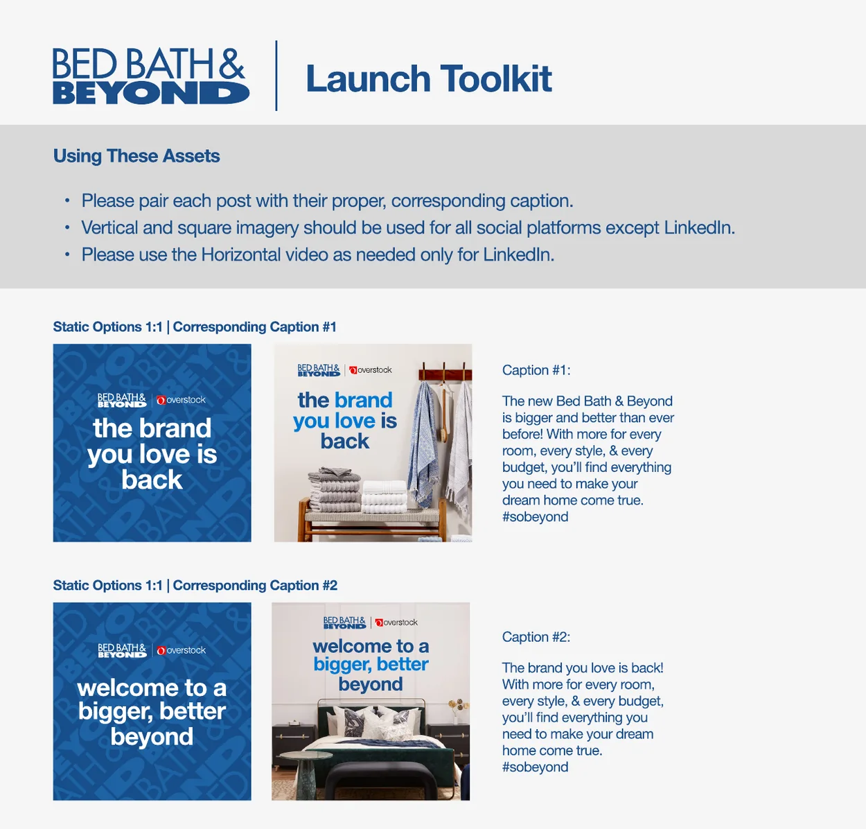
I kept our internal brand guidance and reusable materials current as the rollout changed. The Bed Bath & Beyond launch toolkit shows how the launch team made that guidance usable. It put the approved graphics, the matching captions, and the format instructions on one page. Someone preparing a post could find all three without searching for separate files or asking a designer to assemble them.
Give People a Choice Within the Message
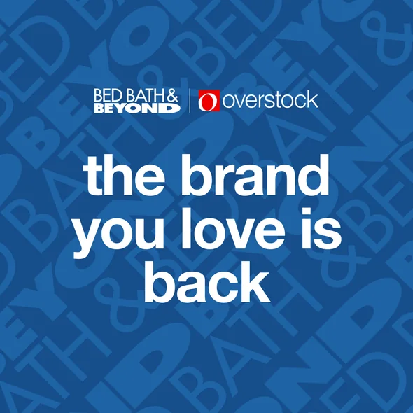
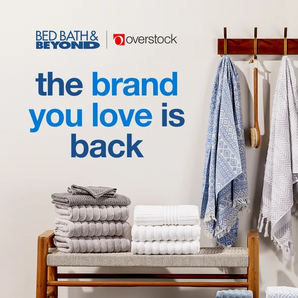
The toolkit offered graphic-led and photo-led versions of the same message. Both versions paired the Bed Bath & Beyond and Overstock marks. The layouts could feel different in a feed while the message and the relationship between the two names stayed consistent.
Make the Channel Decision Easy
The guide directed people to square or vertical assets for social channels outside LinkedIn and to the horizontal video for LinkedIn. The two motion crops preserve the same scene while framing it for different feeds. That small instruction answered a decision people otherwise would have had to make on their own.


Choose the Message
Pick one of the approved launch messages and its paired caption.
Match the Format
Use the square or vertical option for social, or the horizontal video for LinkedIn.
Share From the Same Materials
Start with the approved graphics and copy supplied for the launch.
Give Beyond a Clear Corporate Identity
In November, Overstock.com, Inc. changed its corporate name to Beyond, Inc., moved its listing to the New York Stock Exchange, and began trading as BYON. Bed Bath & Beyond remained the retail identity. Employees needed a practical way to use the new corporate identity, and shareholders needed to recognize the company behind the store.
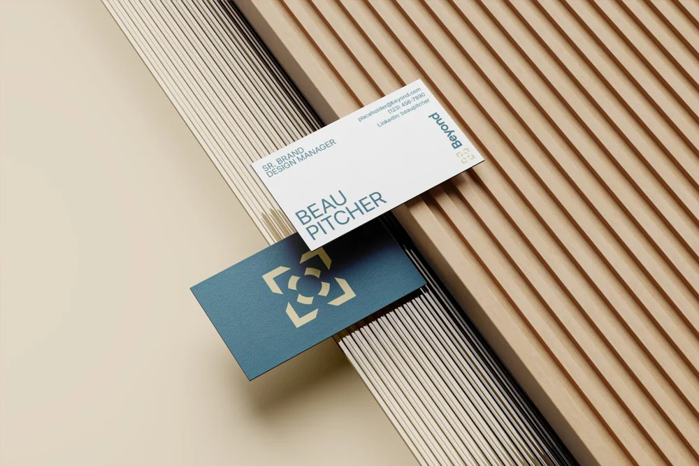
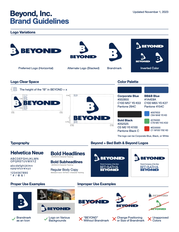
I developed the initial Beyond identity concepts, led selection with stakeholders, and collaborated with an agency on refinement. I carried the chosen direction into the quick-reference guide, business cards, letterhead, email signatures, and presentation templates. The press-kit artwork shows how the corporate and retail marks could appear together when the relationship itself needed explaining.
Make the Corporate and Retail Identities Easy to Use
Once Beyond became the parent company, a deck could represent the retailer or the corporation behind it. Employees needed a starting point that made the distinction clear and let them build a presentation the way they already knew how.
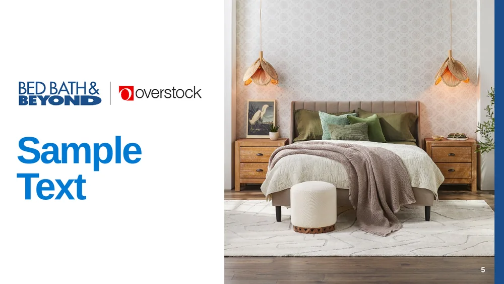
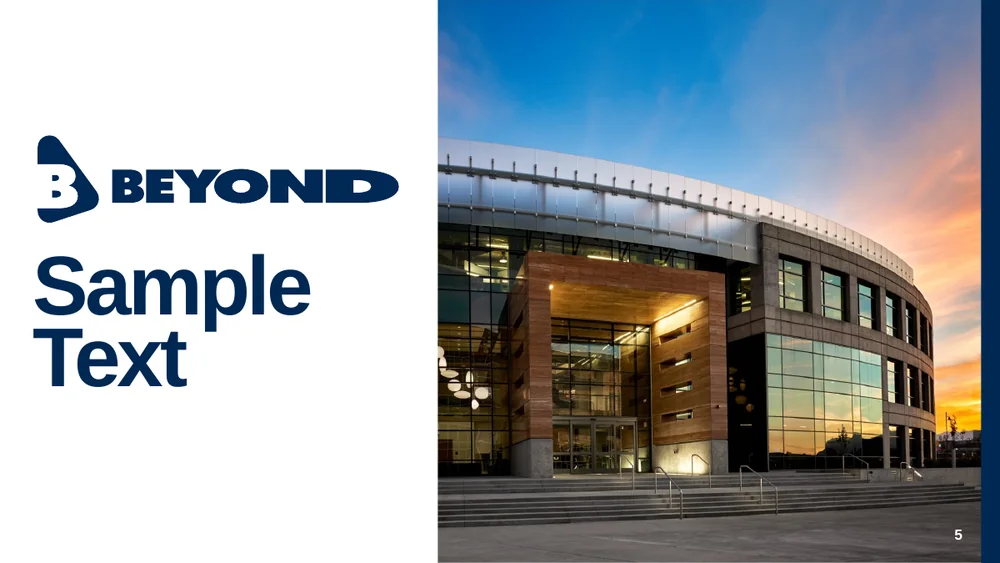
I carried the corporate identity into materials people could use in their everyday work, including the PowerPoint library. The July 2023 Bed Bath & Beyond library and the October 2023 Beyond corporate library show how that worked in practice. Both supplied editable layouts and familiar guidance. The marks, colors, and opening imagery identified the organization speaking.
Keep the Instructions Where People Work
Both libraries begin with guidance before the sample layouts. The first few slides cover when to download the latest version, which font to use, how to resize photos and logos, and how to handle title capitalization. Putting those decisions inside the deck gave people a reference while they were building it.
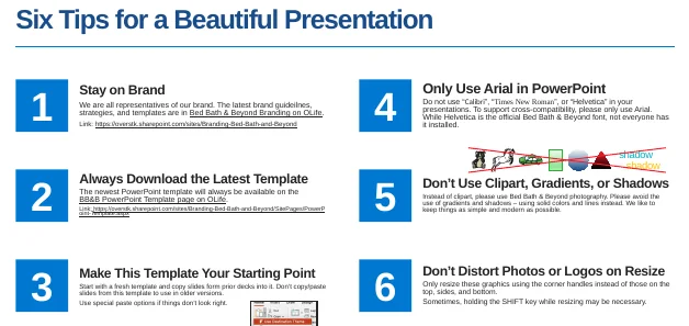
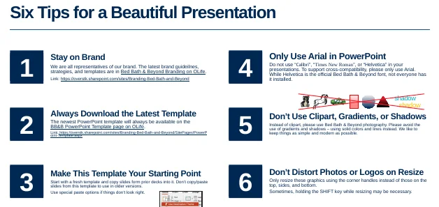
| Part of the Deck | Retail Library | Corporate Library |
|---|---|---|
| Identity | Bed Bath & Beyond and Overstock marks in the archived launch template. | Beyond corporate mark. |
| Sample Opener | Home photography and a bright retail blue. | Company building and a deeper corporate blue. |
| Instructions | Editable layouts and guidance in the deck. | The same familiar way to get started. |
The point of carrying the same structure across the libraries was to make the brand change easier to act on. Teams could choose the right identity for the audience and keep using a familiar tool to do the work.
Tell Shareholders What Changed
I worked with executive stakeholders and Investor Relations to communicate the company’s direction. During the transition, a shareholder needed to connect three pieces of information. The online store had changed to Bed Bath & Beyond, the corporate name was now Beyond, and the stock traded under a new ticker. The corporate identity and messaging needed to make those relationships easy to follow.
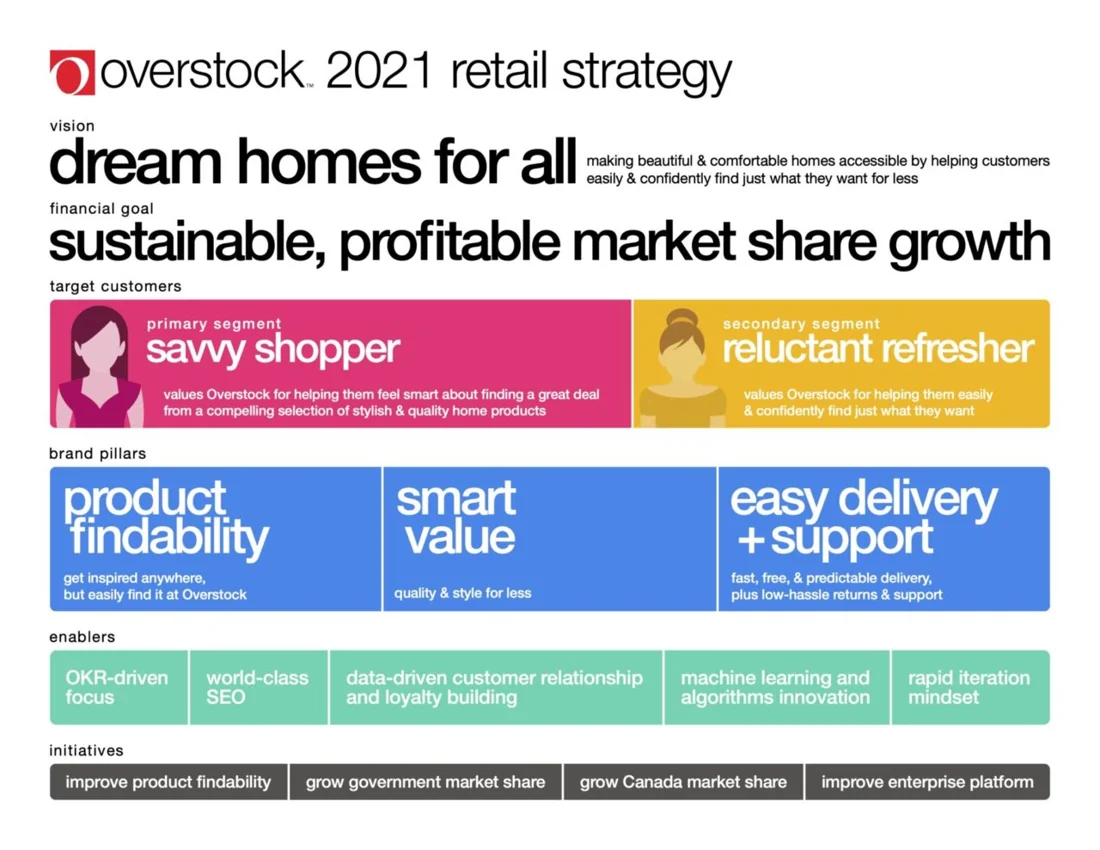
I’d used the same skill before the transition, when I worked with leadership to turn Overstock’s retail strategy into a one-page reference. It connected the company’s goals to the customers and capabilities behind them. During the rebrand, I applied that approach to a faster-moving story, updating materials as the direction changed.
Read the Image as Text
Overstock 2021 retail strategy. Vision: Dream homes for all by making beautiful and comfortable homes accessible and helping customers find what they want for less. Financial goal: sustainable, profitable market share growth.
Target customers: savvy shoppers looking for a great deal on stylish, quality home products, and reluctant refreshers who want to easily and confidently find what they want.
Brand pillars: product findability, smart value, and easy delivery and support. These mean easy discovery, quality and style for less, and predictable delivery with straightforward returns and support.
Enablers: OKR-driven focus, search optimization, data-driven customer relationships and loyalty, machine learning and algorithms, and rapid iteration.
Initiatives: improve product findability, grow government market share, grow Canada market share, and improve the enterprise platform.
Make Sense of Overstock’s Return
When leadership brought Overstock.com back in March 2024, the earlier guidance had to change again. Employees now had two active retail identities to work with. Shareholders needed to understand how two separate storefronts fit into the business under Beyond.
The work gave teams a way to keep producing clear communications as leadership made new decisions. I translated each change into guidance people could find, materials they could use, and a story they could explain to someone else.
Continue Exploring
The storefront change had its own set of decisions about customer programs. I cover those separately in the gift card and Trade case.