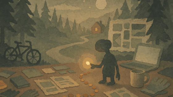
UX Lessons from Home Alone
I hit “play” on Home Alone for what is probably the twentieth time, wrapped in a warm blanket and ready for some slapstick and childhood nostalgia. Lately, I’ve been trying to find comparisons between my favorite movies and lessons I’ve learned in UX. Somewhere between the iced front steps and the paint-can swing, I realized Kevin is basically an eleven-year-old anticipatory-design prodigy. He watches, listens, and plots, then removes friction before the Wet Bandits can even lift the doorknob. Swap burglars for cognitive load and you have a surprisingly complete manual for modern, helpful UX.
Here’s a snapshot of the ideas that covered my coffee table as the movie played. Use these clear, powerful moves to turn your product from a reactive helper into a mind-reading sidekick without the blowtorch.
1. Map the break-in before the burglary
🎬 Scene Setup
Kevin spies on Harry and Marv’s van, times their rounds, and sketches a floor plan of every fragile entry point.
✏️ Design Takeaway
Build a journey map that highlights the moments customers most often “slip on the front steps.” Look at support logs, rage-click heatmaps, or early-exit analytics. Wherever frustration spikes, plant a trap… a gentle one that saves/helps, not injures.
💡 Idea for You to Try
Pull the last 20 chat transcripts. Highlight the first question each user asked. That’s your burglar’s favorite window.
2. Guide users through traps, not lengthy manuals
🎬 Scene Setup
Kevin uses his knowledge of the house and the burglars’ habits to set up layered traps, each one designed to slow the intruders without giving them full knowledge of what’s coming next.
✏️ Design Takeaway
Break down complex tasks into small, manageable steps that guide users forward instead of overwhelming them with full instructions upfront.
💡 Idea for You to Try
Turn one big, complex onboarding or tutorial into a series of small, contextual prompts that appear exactly when the user needs them.
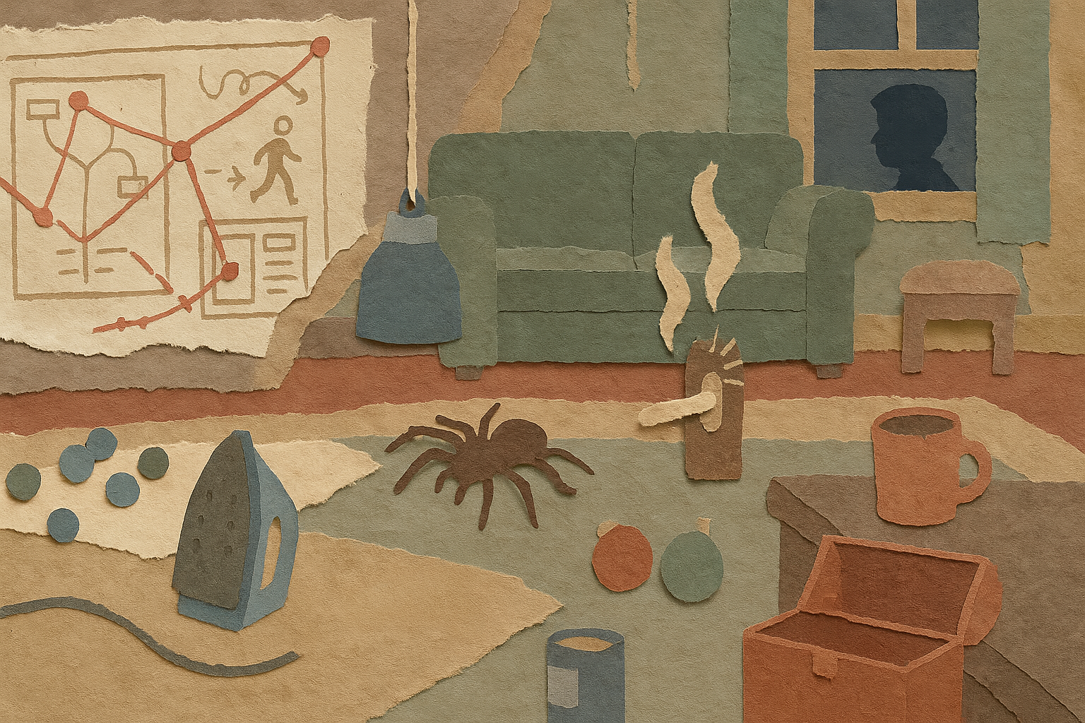
3. Use early-warning cues to detect trouble
🎬 Scene Setup
Kevin’s use of creative triggers like the tarantula on the banister and the iron rigged to fall on the stairs lets him know exactly when and where the burglars are moving.
✏️ Design Takeaway
Set up subtle signals or monitoring tools that alert you when users struggle or deviate, so you can intervene early.
💡 Idea for You to Try
Add event tracking for repeated clicks, rapid toggling, or focus shifts to detect friction points and trigger a helpful nudge or tip.

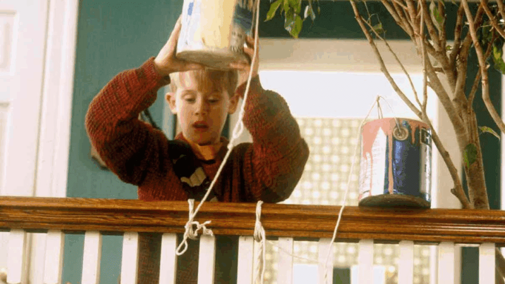
4. Offer one safe shortcut when fear spikes
🎬 Scene Setup
After the blowtorch, Kevin gives the Bandits a “safe path” straight into the BB-gun hallway. Of course they take it.
✏️ Design Takeaway
When the user’s confidence tanks (empty state, blank canvas, failed upload), offer a single, high-certainty action: import sample data, start from template, view guided tour. Make it the glowing hallway they can’t resist.
💡 Idea for You to Try
Identify one blank-canvas experience in your product. Add a single, visually prominent shortcut that guarantees success (even if it’s basic). Make it glow. Literally or metaphorically.
5. Let the user witness the outcome of their effort
🎬 Scene Setup
After all the chaos, Kevin sees the reward: Old Man Marley, once feared and misunderstood, embraces his granddaughter on Christmas morning. No dialogue, just a warm glance and a wave. It’s quiet closure that confirms: Kevin made a difference. Then bam, one last punchline with Buzz yelling, “KEVIN, WHAT DID YOU DO TO MY ROOM!?” serves as comic relief, not an emotional cliffhanger.
✏️ Design Takeaway
When users take a meaningful action by sending an invite, publishing a campaign, or fixing a bug. Show them the ripple effect. Let them see the impact. A toast that confirms “5 teammates just joined,” a customer quote in a feedback loop, or a little spotlight moment in the UI. It tells them: what you did mattered.
💡 Idea for You to Try
Pull one user flow where the success state feels like a dead-end. Add a small “what happened next” touch. Not a badge. A ripple. Something that nods back to them, quietly saying: “You helped someone.”
Team Workshop Idea: The “Wet Bandit” Sensor Board (20 min)
- List the top three actions users abandon mid-flow.
- For each, note the first UI signal that shows they’re stuck (scroll up-down loops, focus ping-pong, repeated ‘undo’).
- Brainstorm a preemptive nudge you could surface < 200 ms after that signal.
- Sketch placement and copy.
- Decide what data you’ll watch to know if the trap…ahem, the assist… worked.
Run this before your next sprint grooming. You’ll leave with candy-trail tasks, not just backlog wishes.
The house after the credits and measuring impact without numbers
Kevin never sees analytics dashboards, yet we know the traps worked: the burglars land in jail, the house stays intact, Mom hugs Kevin by the tree. In product land, anticipatory design shows up as:
• Shorter help center sessions per user
• Fewer rage clicks in Datadog replays
• Support asking, “Where did all those tickets go?”
• Stakeholders hearing customer quotes like, “It felt like the app read my mind.”
No spreadsheet or Confluence doc required; the calm speaks volumes.
And That’s A Wrap
Anticipatory UX isn’t magic. It’s quiet observation plus timely breadcrumbs. It’s like an 11-year-old setting marbles on a hardwood floor exactly where the crooks will slip. When products pick up that instinct, users breeze through flows they used to dread and walk away singing holiday-movie praises.