The only thing we can count on is that next quarter will surprise us. A new device launches. A regulation shifts. Or a scrappy competitor ships something that resets expectations overnight.
When that happens, rigid design systems start to crack. But flexible UX architecture can bend. It absorbs the shock and keeps things moving. I explore what that flexibility looks like, why it’s more useful than trying to perfect things upfront, and a few small ways to build it into your work right now.
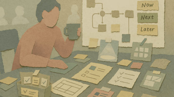
What Flexible UX Architecture Really Is
Flexible UX architecture is like building with LEGO in freestyle mode. You can add or remove pieces without tearing everything apart. And when needed, you can even rework whole sections without starting over. These aren’t just surface-level tweaks. They live deeper in the system as navigation patterns, content zones, and shared components. Now you (or someone else) can make updates without redrawing the entire blueprint.
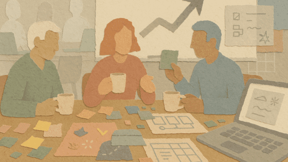
Why Flexibility Pays Off
1. It helps you move faster
When something unexpected pops up, like a new partnership or policy notice, you can make space for it. No need for a total redesign. Just plug it in and go.
2. It keeps tech debt under control
Well-contained modules mean you can update one section, like a billing step, without affecting the rest of the flow.
3. It helps users stay confident
Changes land gently. Familiar anchors stick around, so people feel like they’re in the same product they already trust.
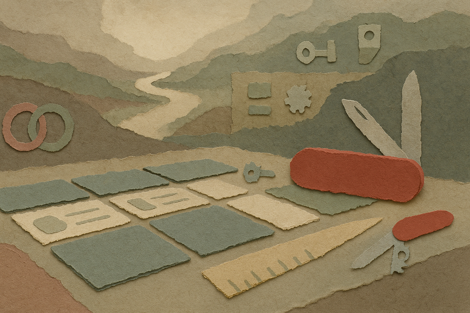
A Good Analogy: The Swiss Army Knife
Think about what makes a Swiss Army Knife work. It’s not just that it has a lot of tools. It’s how those tools fold in and stay out of the way until you need them.
- Each one shares the same pivot, so adding a new blade doesn’t require redesigning the handle
- Clear handles make it easy to find the tool you’re looking for, even in a rush
- The rest stay tucked away, so the tools you’re not using don’t get in your way
Flexible UX works the same way. You define shared patterns like layout grids or token sets. Then you add tools as needed, whether that’s an upsell card or a real-time preview. If something isn’t needed right now, it stays invisible but still ready.
Four Ways to Design with Flex in Mind
| Principle | How to apply it | Why it helps |
|---|---|---|
| Separate core from optional | Define the simplest path a user must take. Add everything else as optional modules. | Keeps your scope clear and your team focused. |
| Use elastic layouts | Build with ratios, flexible type, and responsive patterns. | One layout works across phones, tablets, TVs, or VR headsets. |
| Prefer config over customization | Use flags, CMS fields, or structured data before writing custom code. | Teams can update or test changes without a big release. |
| Reveal complexity only when needed | Show advanced features only when a user’s actions call for them. | Helps the interface stay calm but still powerful. |
Try This: The 90-Day Curveball Drill
Pick one important user flow.
Maybe it’s onboarding.
Now, imagine something unexpected is going to affect that flow in 90 days. Could be a new language, a biometric login, or a promotional banner.
Then ask:
- Where would it fit?
- How many screens or components would break?
Score the result from 1 to 5. A 1 means a total rewrite. A 5 means it slides right in.
Now brainstorm one fix that would raise the score.
Repeat this exercise next sprint with a different surprise. You’ll slowly build a system that stays ready for change.
Signs Your Design Might Be Too Rigid
- A new country means duplicating screens instead of translating strings
- Dark mode needs a complete redesign
- Wearable support starts with “let’s rebuild the whole thing”
- Roadmap planning stalls because there’s no clear place for new features
- Emergency design patches pile up right before launches
If more than one of those sounds familiar, your system is probably carrying some quiet flexibility debt.
A Simple First Step
Pick one layout or pattern that feels fragile. Maybe it’s a promo banner.
Turn it into a flexible block with a title, image, body text, and button. Wire those fields into both the design file and code. Then hand it off to someone outside your team to change the content.
When the next campaign goes live, count how many engineering hours you saved. That’s your early win.
Final Check-In
Designing for the unknown isn’t about predicting the future. It’s about staying ready. Keep your architecture modular. Share the same structure across tools. Only show complexity when it’s needed.
That way, no matter what comes next, your product can meet the moment without falling apart.