Overview
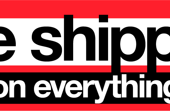
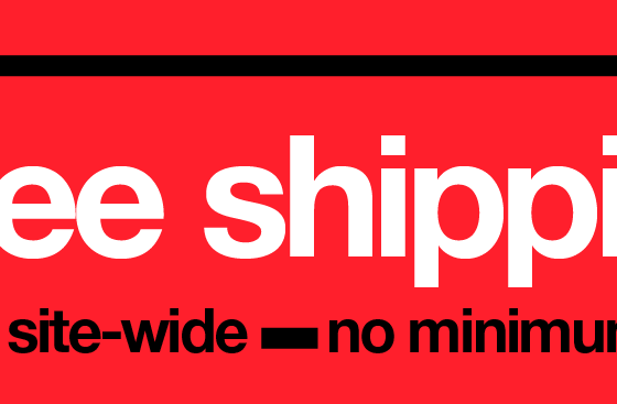
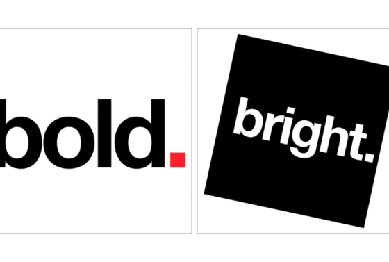
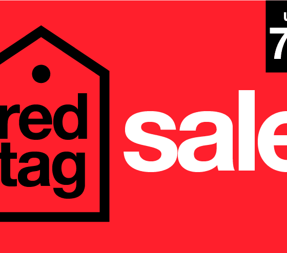
In an effort to position Overstock as a modern, innovative leader in the retail space, I led an update to the company’s visual design, guided by the core principles of “Big, Bold, Bright, and Simple.” The goal was to completely overhaul Overstock’s existing visual identity, creating a more distinctive, dynamic, and memorable brand presence. While many of the concepts from this initiative were not immediately implemented, they served as a blue sky vision that ultimately paved the way for Overstock’s ongoing evolution.
The Challenge
- Positioning Overstock as a Modern Brand: Overstock needed a visual redesign that would help the company stand out as an innovative, approachable, and forward-thinking leader in the competitive retail landscape.
- Balancing Simplicity with Creativity: Overstock’s previous design elements were somewhat traditional and didn’t fully capture the vibrancy and energy of the brand. The challenge was to introduce new design concepts that would stand out without being overwhelming, creating a brand experience that was both bold and approachable.
- Long-Term Evolution: While the design elements proposed in this update were not fully implemented immediately, the project aimed to introduce a visionary approach to the company’s future direction, setting the stage for future rebranding initiatives.
My Role
As the lead designer overseeing this visual design update, I was responsible for:
✅ Introducing a new visual strategy based on the “Big, Bold, Bright, and Simple” philosophy.
✅ Crafting a range of design concepts that would reshape Overstock’s brand identity, pushing the boundaries of traditional retail design while maintaining a strong connection to the brand’s values.
✅ Collaborating with stakeholders to align the design with Overstock’s broader business goals and aspirations, ensuring it would position the brand for long-term success.
Approach & Solution
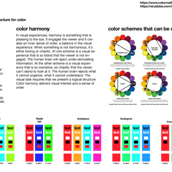
1. Bold, Bright, and Distinctive Colors
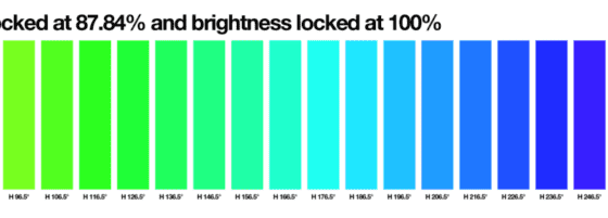
- Strategy: I introduced a vibrant color palette that pushed Overstock’s brand into the realm of boldness and energy. The goal was to create a more visually impactful brand identity that would easily stand out in a crowded market.
- Outcome: While the new colors weren’t immediately deployed, they became part of Overstock’s evolving visual strategy and helped inform the look and feel of future campaigns and digital touchpoints. Over time, these bold colors were incorporated into advertising, website elements, and social media content, marking the beginning of Overstock’s visual transformation.
2. Clean Lines and Minimalist Aesthetic
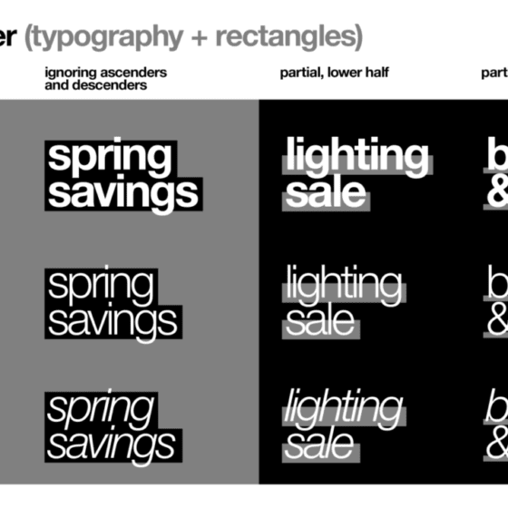
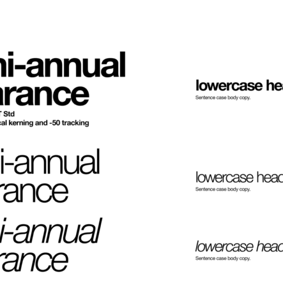
- Strategy: To complement the bold color palette, I focused on clean lines and simplicity, applying minimalist design principles to ensure Overstock’s messaging remained clear and direct.
- Outcome: This clean aesthetic proved to be a solid foundation for the future, influencing the UI design for Overstock’s digital platforms, where minimalism and clarity were prioritized to improve the user experience.
3. Eye-Catching Graphics
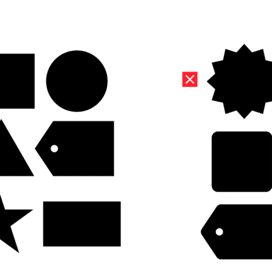
- Strategy: The update included graphic elements that incorporated bold patterns, geometric shapes, and dynamic visuals. These elements were designed to add visual interest while maintaining a sense of balance and simplicity.
- Outcome: Though not immediately adopted across all platforms, many of these visual components began to influence future digital designs, especially in advertising materials and email campaigns, where bold, eye-catching graphics became more prevalent.
4. Versatile Application Across Touchpoints
- Strategy: I proposed a new visual framework that could be easily applied across Overstock’s digital and print assets, from websites and social media to physical advertising and in-store experiences. This adaptability was key to ensuring the brand would be consistent and cohesive across all platforms.
- Outcome: The new visual framework was rolled out gradually, beginning with digital assets and expanding into print materials, packaging, and advertising campaigns. Over time, this design system became the backbone of Overstock’s branding, reinforcing its position as a modern and innovative company.
Results & Impact
✅ A Modernized Brand Presence: The new visual direction helped Overstock shift toward a more modern and innovative brand, aligning with the company’s long-term goals of differentiation and growth.
✅ Increased Consistency Across Channels: The gradual adoption of the updated visual identity ensured greater consistency across Overstock’s digital and physical touchpoints, fostering a stronger brand presence.
✅ Long-Term Strategic Impact: While the update wasn’t implemented overnight, it laid the groundwork for Overstock’s continued evolution, influencing future marketing campaigns, website redesigns, and even product packaging.
✅ Improved User Engagement: The cleaner, more vibrant designs improved Overstock’s user experience across digital platforms, with greater emphasis on visual hierarchy and simplicity to drive engagement.
Key Takeaways
✔ The “Big, Bold, Bright, and Simple” visual update introduced a more modern and dynamic aesthetic, positioning Overstock as an innovative brand ready to stand out in the market.
✔ The new color palette, clean lines, and graphic elements began to shape Overstock’s evolving brand identity, improving its visual appeal and brand recognition.
✔ Although many elements of the proposal were not immediately deployed, the long-term strategic impact was undeniable, as Overstock gradually adopted these ideas in its branding and marketing efforts.
✔ The project exemplified Overstock’s commitment to innovation and creative growth, setting the stage for a more bold and visually impactful future.
