Overview
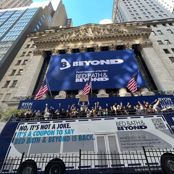
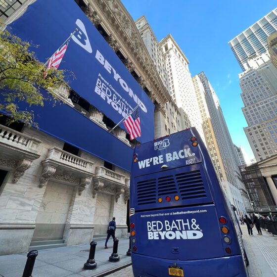
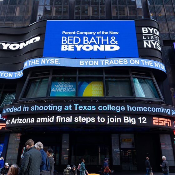
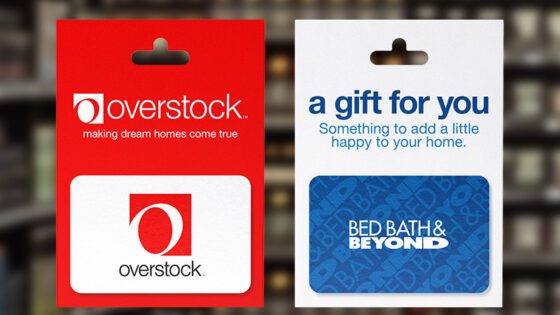
In November 2023, Beyond, Inc. emerged as a transformative business entity, poised to redefine its identity and strategy. As the creative force behind the initial rebrand, I played a pivotal role in shaping the company’s visual identity and branding direction. Drawing inspiration from Bed Bath & Beyond’s legacy, I created the first branding concepts and led the team to select the final design. Later, I worked with an agency to refine and introduce new elements in response to requests from the newly appointed Chairman of the Board. This updated branding direction set the stage for a broader, consumer-facing future and a successful move from NASDAQ to the New York Stock Exchange (NYSE).
Additionally, I was tasked with designing brand activation materials to celebrate Beyond’s listing on the NYSE. This included designing a full courtyard area outside the NYSE on Wall Street and creating signage for the NYSE trading floor, public spaces, and conference rooms. Although the planned activation was ultimately canceled due to organizational changes the night before the event, the designs were fully conceptualized and ready for execution.
The Challenge
- Transition from NASDAQ to NYSE: Beyond, Inc.’s rebrand needed to reflect its growth and transformation, marking its move from NASDAQ to the New York Stock Exchange (NYSE).
- Creating a New Visual Identity: The new brand had to honor Beyond’s legacy while introducing a fresh, forward-thinking identity that would resonate with both internal teams and external consumers.
- Bridging Legacy with Innovation: The design had to blend elements of the Bed Bath & Beyond brand, a significant part of Beyond’s history, with new elements that represented the company’s shift to a more diverse, consumer-facing business.
- Company-wide Asset Integration: The new branding assets had to be cohesive across all levels, from corporate templates to employee communications, ensuring seamless integration into the daily functions of the company.
- Brand Activation for NYSE Move: Beyond’s listing on the NYSE required a celebratory brand activation that would showcase the brand’s evolution and new direction. The design needed to make a lasting impression during a historic moment for the company, requiring careful attention to detail and alignment with the brand’s overall identity.
My Role
As the lead designer for Beyond, Inc.’s rebrand, I was responsible for:
✅ Creating the original branding concepts, including the logo design, and leading the process to finalize the selection.
✅ Collaborating with the newly appointed Chairman of the Board to incorporate new elements and strategic vision into the branding refresh.
✅ Partnering with an external agency to refine the visual identity and introduce fresh concepts that aligned with the updated strategic direction.
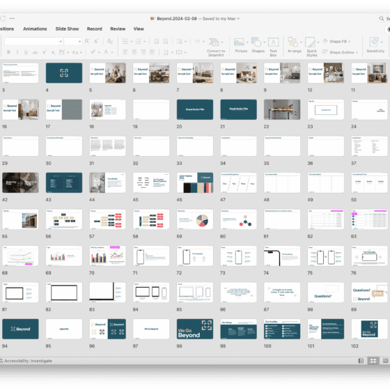
✅ Developing corporate templates, including letterhead, email signatures, and PowerPoint templates, to ensure consistent, professional communication across all channels.
✅ Designing brand activation materials for Beyond’s NYSE move celebration, including a full courtyard area outside the NYSE on Wall Street and signage for the NYSE trading floor, public spaces, and conference rooms.
✅ Leading the design of a dynamic, accessible brand system that reinforced Beyond’s evolving mission and identity.
Approach & Solution
1. Creating the Original Branding Concepts
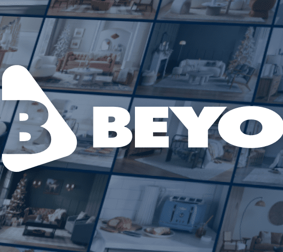
- Strategy: In the early stages of the rebrand, I developed multiple branding concepts, drawing inspiration from Bed Bath & Beyond’s legacy logo to create a fresh, modern design. I worked closely with key stakeholders to evaluate and select the final logo that best represented Beyond’s new direction while honoring its heritage.
- Outcome: The selected logo became the foundation for the brand’s identity, symbolizing the company’s shift from a traditional retail model to a dynamic, consumer-focused business. This identity played a pivotal role in the transition to the NYSE and helped communicate Beyond’s growth and forward-thinking vision.
2. Branding Refresh with Agency Collaboration
- Strategy: After the initial branding was established, I worked with an external agency to introduce a branding refresh as requested by the newly appointed Chairman of the Board. This refresh included refining the existing elements and integrating new concepts to better align with Beyond’s evolving strategic vision.
- Outcome: The refresh brought a refined, cohesive look to the brand, incorporating fresh ideas that enhanced the company’s consumer-facing presence. By collaborating with the agency, we successfully balanced innovation with continuity, ensuring the updated branding stayed true to the company’s roots while capturing its forward momentum.
3. Designing Brand Activation Materials for NYSE Move Celebration
- Strategy: To celebrate Beyond’s move to the New York Stock Exchange (NYSE), I was tasked with creating immersive brand activation materials that would showcase Beyond’s new identity and help mark the momentous occasion. This involved designing a beautiful courtyard area in front of the NYSE on Wall Street, including green turf, white picket fences, and a large archway shaped like a house through which people would pass before entering the NYSE trading floor.
- Outcome: Although the activation was ultimately canceled, the courtyard design was fully conceptualized, and the archway design stood as a symbolic representation of Beyond’s transformation. It would have created a memorable entry point for guests and employees alike, marking the company’s growth and shift toward a more consumer-centric identity.
4. Designing Signage for the NYSE Trading Floor and Public Spaces
- Strategy: In addition to the courtyard activation, I also designed signage to be displayed across the NYSE trading floor, public spaces, and conference rooms. The signage had to be professional, clear, and consistent with the updated brand identity, while still capturing the excitement of Beyond’s NYSE debut.
- Outcome: The signage designs were prepared and ready to be displayed, ensuring Beyond’s presence was clearly represented across the NYSE. These designs reinforced the company’s new identity and would have contributed to the cohesive brand experience on the historic day.
5. Developing Consistent Corporate Templates
- Strategy: To ensure Beyond’s visual identity was cohesive, I designed several key corporate templates, including letterhead, email signatures, and a company PowerPoint template. These templates were designed to reflect the brand’s values, maintain professionalism, and ensure consistency across all forms of internal and external communication.
- Outcome: These templates helped create a unified brand presence, ensuring that all company communications felt aligned with Beyond’s new identity. Employees and partners could easily access and utilize these materials, contributing to a cohesive brand experience.
6. Preparing for a Consumer-Facing Future
- Strategy: Beyond’s transition to a consumer-facing brand required a bold rethinking of its visual assets. I worked closely with the Sightbox team to ensure that the branding would be accessible and engaging for customers, not just employees. This included designing assets for new digital touchpoints, from social media graphics to website banners, and expanding the brand’s presence beyond just retail.
- Outcome: The new consumer-facing brand captured the company’s diverse offerings and strategic direction, with a visual language that was approachable, inclusive, and dynamic. This enabled Beyond to connect with a broader audience, from retail shoppers to customers interested in the company’s expanded services.
7. Streamlined Accessibility and Integration for All Employees
- Strategy: One of the key priorities was ensuring that all employees and business partners could access the new branding materials seamlessly. I developed a centralized asset library that provided quick and easy access to all print and digital assets, including logo files, templates, and brand guidelines. This was particularly important for ensuring brand consistency at every level of the company.
- Outcome: With easy access to the materials, the rebrand became self-sustaining and empowered employees to consistently uphold Beyond’s visual identity. The library helped ensure that the brand’s integrity remained intact as it was rolled out across different departments and communications channels.
Results & Impact
✅ Successful Transition to NYSE: The new branding played a key role in communicating Beyond’s growth and transition to the New York Stock Exchange (NYSE), setting the stage for a new chapter in the company’s evolution.
✅ Unified Brand Identity: The new logo and corporate templates ensured a consistent and professional brand identity, both internally and externally.
✅ Enhanced Consumer-Facing Presence: As Beyond pivoted toward a consumer-facing future, the rebranding efforts successfully captured the company’s new direction and expanded services, resonating with a broader customer base.
✅ Memorable NYSE Activation (Conceptualized): While the courtyard design and signage activation plans were ultimately canceled, they were fully conceptualized and ready to bring Beyond’s new identity to life during the high-profile NYSE debut.
✅ Improved Accessibility for Employees and Partners: The centralized asset library empowered employees and business partners to easily access and integrate the new branding into their work, ensuring consistent communication across all channels.
Key Takeaways
✔ Brand Evolution and Consistency: The rebranding journey for Beyond, Inc. demonstrated the power of evolution within a brand. Balancing the legacy of Bed Bath & Beyond with the need for a modern identity was a complex yet rewarding process, resulting in a visual identity that successfully represented the company’s new direction and expansion into new areas.
✔ Collaboration Across Teams: From working with the Chairman of the Board to collaborating with an external agency and other internal stakeholders, the rebrand was an exercise in communication and teamwork. The result was a unified, cohesive identity that served as the foundation for a new chapter for Beyond, Inc.
✔ Flexibility in Design Execution: The cancellation of the brand activation highlighted the importance of being flexible and adaptable in design. While the activation itself didn’t come to fruition, the designs were still impactful and ready for future use when the time was right. The ability to pivot while still maintaining the integrity of the brand identity was crucial in this fast-paced environment.
✔ Cross-Department Integration: Ensuring that the new branding was accessible and usable by every employee, from the executive suite to the marketing teams, made the transition smoother and more efficient. The centralized asset library proved to be a key tool for maintaining consistency across all communications and design materials.


