Have you ever seen a prototype look perfect in Figma, only to watch it unravel a few sprints later? Suddenly, three teams have copied the same components but renamed everything. A quarter later, those copies start to drift apart. The front-end team writes quick custom CSS to match the new look, and QA reports bugs because the same button now measures four different heights.
If this sounds familiar, you know the trouble products face when they grow faster than their design system can keep up.
Let’s explore why a flexible, shared system beats one-person magic, how to build one that scales with your team, and some simple steps to get started.
What Is a Design System?
A design system is more than just a collection of style guides or stickers. It’s a living set of agreements that link reusable UI patterns, coded components, clear documentation, and rules for how people contribute. This lets every team deliver consistent, on-brand work without reinventing the wheel. The design system becomes the single source of truth, guiding everything from user research through to final code.
Why It Matters
- Consistency Builds Trust
Users notice when buttons stay the same shade of blue whether they’re on web, mobile, or a kiosk. Familiar visuals make tasks easier and boost confidence in your product. - Reuse Speeds Things Up
When tokens, spacing rules, and components are ready to go, teams spend less time creating from scratch. Features launch sooner and technical debt stays manageable. - A Shared Language Helps Teams Work Better
Design tokens turn vague color names like “off white” into exact variables like grey-100. Designers and engineers speak the same language, saving time and confusion.
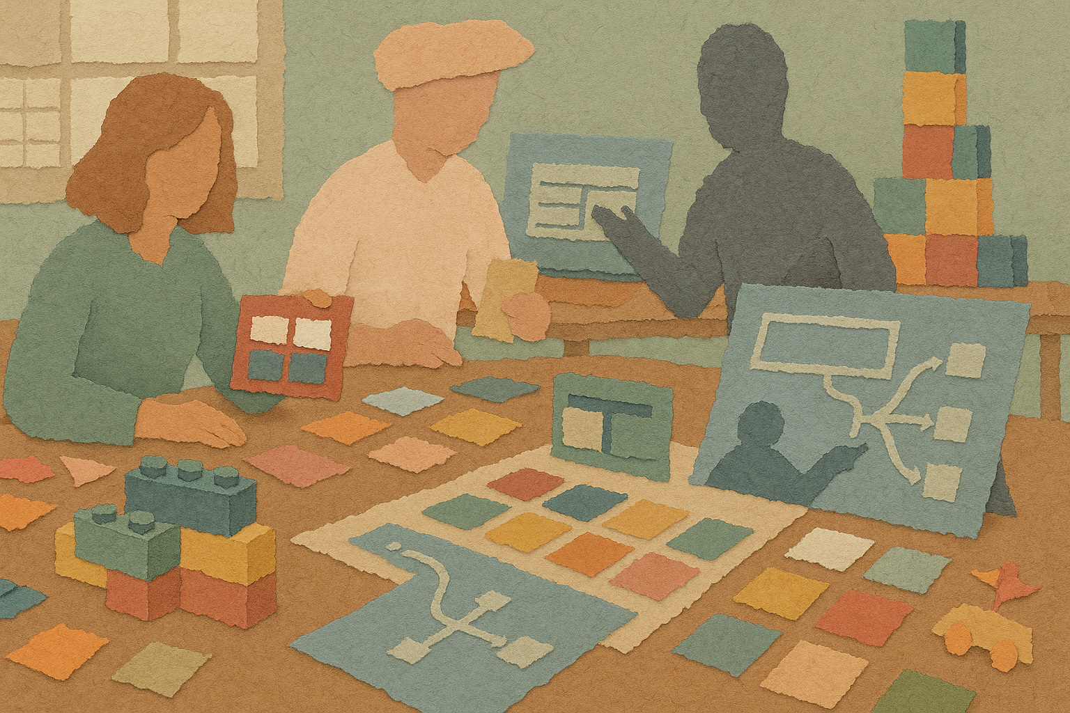
Think of It Like LEGO Bricks
Imagine building a city with friends. If everyone brings random clay, every building looks different and nothing fits together. But if you use LEGO bricks, every piece snaps neatly into place. Your spacing tokens are like the studs on the bricks, the colors are your palette, and your component guidelines are the instructions. Because LEGO pieces connect by design, you can build a city that grows from a small house to a whole skyline without rebuilding from scratch.
The Three Hats a System Designer Wears
| Architect | Librarian | Coach |
| Sets the foundation like color palettes, type scales, spacing rhythms, and elevation rules. This person makes key decisions once so they apply everywhere. | Organizes components in a clear, searchable place. No duplicates, just one version per part with notes, code examples, and accessibility checks. | Helps teams understand when to use, change, or suggest new parts of the system. Runs reviews, hosts office hours, and celebrates contributions to keep the system alive. |
Check Your Design System’s Health with Five Questions
Take a moment to score your current design setup on a scale from 1 to 5:
| Focus | Question | Score |
| Tokens | Are color, spacing, and typography tokens documented and used in code? | [ ] |
| Components | Do design and code components share the same names and properties? | [ ] |
| Governance | Is there a clear way to suggest, review, and approve changes? | [ ] |
| Documentation | Can a new team member understand usage rules within twenty minutes? | [ ] |
| Adoption | What percentage of new features use system parts versus one-offs? | [ ] |
Add up your score. If it’s below 15, it might be time to give your system some attention.
Signs Your Design System Needs Work
- Designers paste screenshots into tickets because they worry the code won’t match Figma.
- Engineers copy CSS from older features to meet deadlines.
- The same icon appears in multiple sizes or colors across the product.
- QA files bug reports about misaligned buttons every sprint.
- New teams ask, “Which component should I use for this?” on Slack.
If you see two or more of these, quick fixes won’t keep up with growing debt.
A Simple First Step
Pick a popular feature and focus on cleaning up its main button styles. Define one true set of tokens for color, border radius, and disabled states. Publish the code in your component library or Storybook. Track how many bugs drop and how much handoff time you save. One small win can open the door to bigger improvements.
Bringing It All Together
A strong design system is the backbone of a product that scales without falling apart. It keeps teams aligned, speeds up delivery, and ensures a consistent look and feel. When a designer takes on the roles of architect, librarian, and coach, all the scattered pieces start fitting perfectly. This is how you build a product that grows smarter, stronger, and more reliable with every sprint.