Fourteen hours of broomsticks and Butterbeer started as comfort watching. Somewhere between the floating candles and Hogsmeade snow, it hit me: every scene, no matter how far from Hogwarts castle, still feels unmistakably ‘wizardy’. Why? Tiny, reusable details, scroll-edge parchment, Latin-ish spell words, bold house colors, act like GPS beacons.
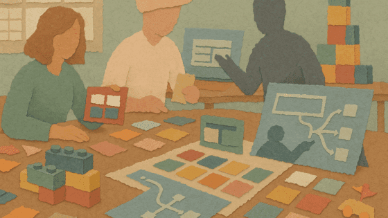
Back at my desk I opened our custom reporting dashboard beside our subscription management portal and felt whiplash. Same product, two entirely different dialects. That’s when the what-ifs began. What if we borrowed Hogwarts’ connective tissue to weave our own modules into one recognizable world? The following ideas outline what we could do, next quarter or next week, to cast that spell.
1. Turn orientation cues into a roaming compass
🎬 Scene Setup
The Daily Prophet’s typeface, a glowing wand tip, a Slytherin crest, these pop up in every corner of the saga, instantly grounding viewers.
✏️ Design Takeaway
Build shared visual cues that anchor users no matter where they are. Fonts, colors, shapes, these act like waypoints on a map.
💡 Idea for You to Try
Run a “compass audit” of your UI. Strip logos off three different screens. If teammates can’t tell they belong together, list the missing shared cues: font weights, motion curves, corner radii. Then create a micro-style guide for those cues. Even two constants, like headline font and button shape, would help users feel grounded as they move between modules.
2. Treat microcopy like spellcraft, concise, vivid, certain
🎬 Scene Setup
“Lumos” casts light; “Nox” snuffs it out. There is no confusion or hesitation in these simple spells.
✏️ Design Takeaway
Use microcopy that is clear and purposeful. Avoid vague or long instructions. Each phrase should feel like a precise spell with a single effect.
💡 Idea for You to Try
Identify CTAs longer than two words. Workshop replacements that are one or two words, with a magical feel: “Merge,” “Invite,” “Save.” Pair each with a short hover hint that acts like a quick tutorial for users.
3. Borrow heraldry, icons, and palettes that speak emotion
🎬 Scene Setup
A red and gold lion means courage. A green and silver snake means ambition. Color and icon together tell a story in an instant.
✏️ Design Takeaway
Assign colors and icons to core emotional states in your product. Use these combinations consistently so users instantly understand the message.
💡 Idea for You to Try
Map four emotions like risk, insight, celebration, and neutral. Assign each a unique color and glyph. Use these combinations across charts, banners, and badges. For example, a crimson shield could mark destructive actions, while a cobalt lightbulb signals analytics wins. This creates a clear visual language.
4. Create release rituals users can mark on their calendars
🎬 Scene Setup
Owl post arrives at breakfast. Sorting Hat on day one. Exams in June. Hogwarts life has a predictable rhythm that comforts students.
✏️ Design Takeaway
Set a consistent schedule for releases and updates so users know what to expect and when.
💡 Idea for You to Try
Pick a regular weekday for release notes. Host a monthly livestream, like a “Great Hall” meeting, with the same host and format to preview new features. This helps users prepare and lowers anxiety around changes.
5. Gate advanced magic, let power grow with mastery
🎬 Scene Setup
First-years learn levitation spells, but casting a Patronus takes years of practice. Power grows as wizards mature.
✏️ Design Takeaway
Hide advanced features until users reach milestones. This encourages growth and keeps the experience approachable for new users.
💡 Idea for You to Try
Unlock pro filters or API access after users hit certain usage milestones. Celebrate progress with a subtle animation or message. Offer tutorials as short quests to earn new powers and turn learning into a story.
6. Imagine the pay-offs before we commit the dev hours
- Onboarding confusion fades because visual grammar stays constant.
- Support shifts from “Where am I?” to “How do I get the most out of this?”
- Marketing demos tell a single clear story, helping sales close faster.
- Design speeds up with reusable tokens replacing one-off styles, and QA focuses shrink.
We won’t know exact results until we try, but Hogwarts shows that consistency makes everything work better.
7. First steps for the next sprint
- Run a compass audit, 30 minutes, three screens, no logos.
- Workshop five CTAs into spell-like one-word commands.
- Draft heraldry, pick colors and glyphs for two emotions.
- Set a standing calendar slot for release notes and invite the team.
- Choose one advanced feature to unlock after a usage milestone.
Even one of these steps can start clearing the fog and making your product feel more magical.
All aboard the Hogwarts Express!
Hogwarts doesn’t feel magical by accident. Its creators paid attention to every floating candle and every corridor echo. We haven’t done that deep work yet, but we could. By tightening the story, repeating key details, and creating a consistent experience, users might choose to live in our product world, not just visit.
It might feel a little silly to compare UX design so closely to Harry Potter, but that’s exactly the point. If this has gotten your wheels turning, imagining your product as its own magical world, then it has done its job. Sometimes thinking through a story helps us see the details that make all the difference.