
Project Overview
At Rentler, I played an integral role in the design and development of the online rental applications, creating seamless and intuitive experiences for both tenants and landlords. From initial concept to production, I collaborated with the team to ensure that our digital platform was both user-friendly and efficient, meeting the needs of both parties in the rental process.
The Challenge
Rentler sought to improve the online rental application process for tenants and landlords, making it quicker, easier, and more efficient. The challenge was to create an intuitive, seamless experience while balancing the specific needs of both users—tenants applying for housing and landlords reviewing applications. We wanted to ensure the platform would simplify the rental process while maintaining security, compliance, and ease of use.
Key Objectives:
- Simplify the application process for tenants by making it easy to fill out forms and submit documents.
- Provide landlords with an efficient review process, including all necessary tenant details and supporting documentation.
- Create a visually appealing and cohesive design for both tenant-facing and landlord-facing interfaces.
My Role
I was deeply involved in every aspect of the project, from concept to production:
✅ User Experience Design: Created wireframes, user flows, and interaction design for both tenant and landlord-facing experiences.
✅ Visual Design: Led the design of the 2016 update to the rental application interface, ensuring it aligned with Rentler’s evolving brand.
✅ Usability Testing: Conducted usability testing to ensure that both tenant and landlord experiences were intuitive and optimized.
✅ Information Architecture: Organized content and navigation in a way that minimized friction for users while ensuring all necessary information was easily accessible.
Approach & Solution
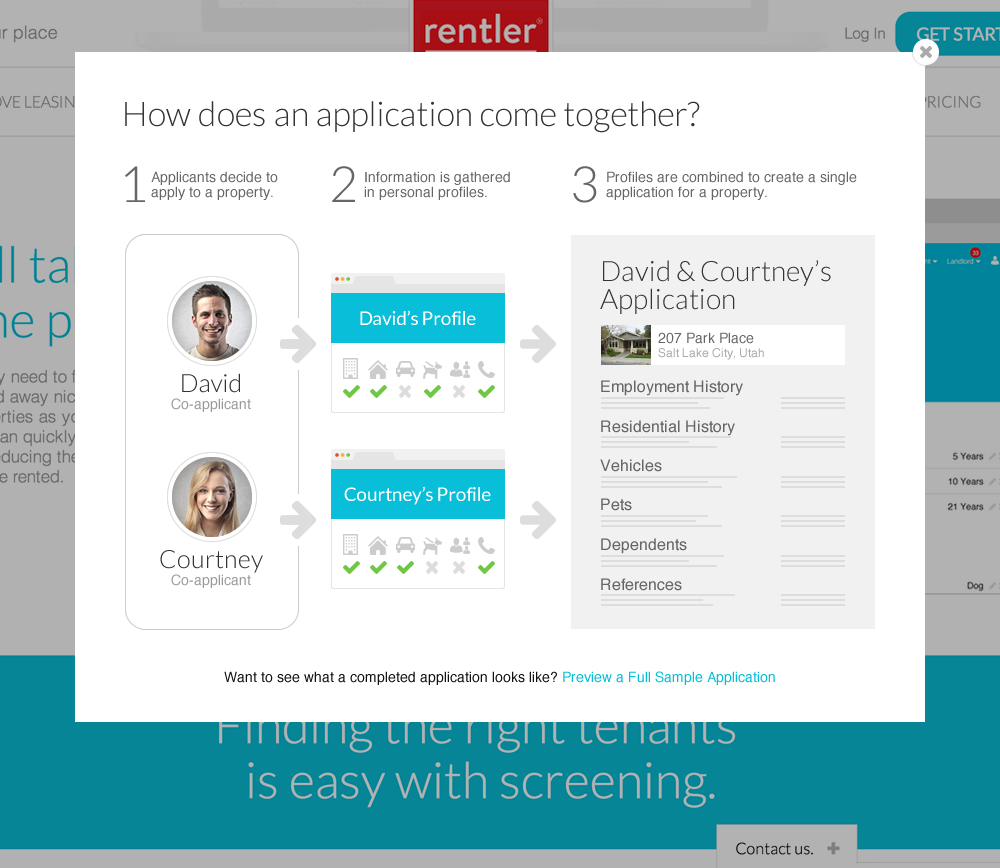
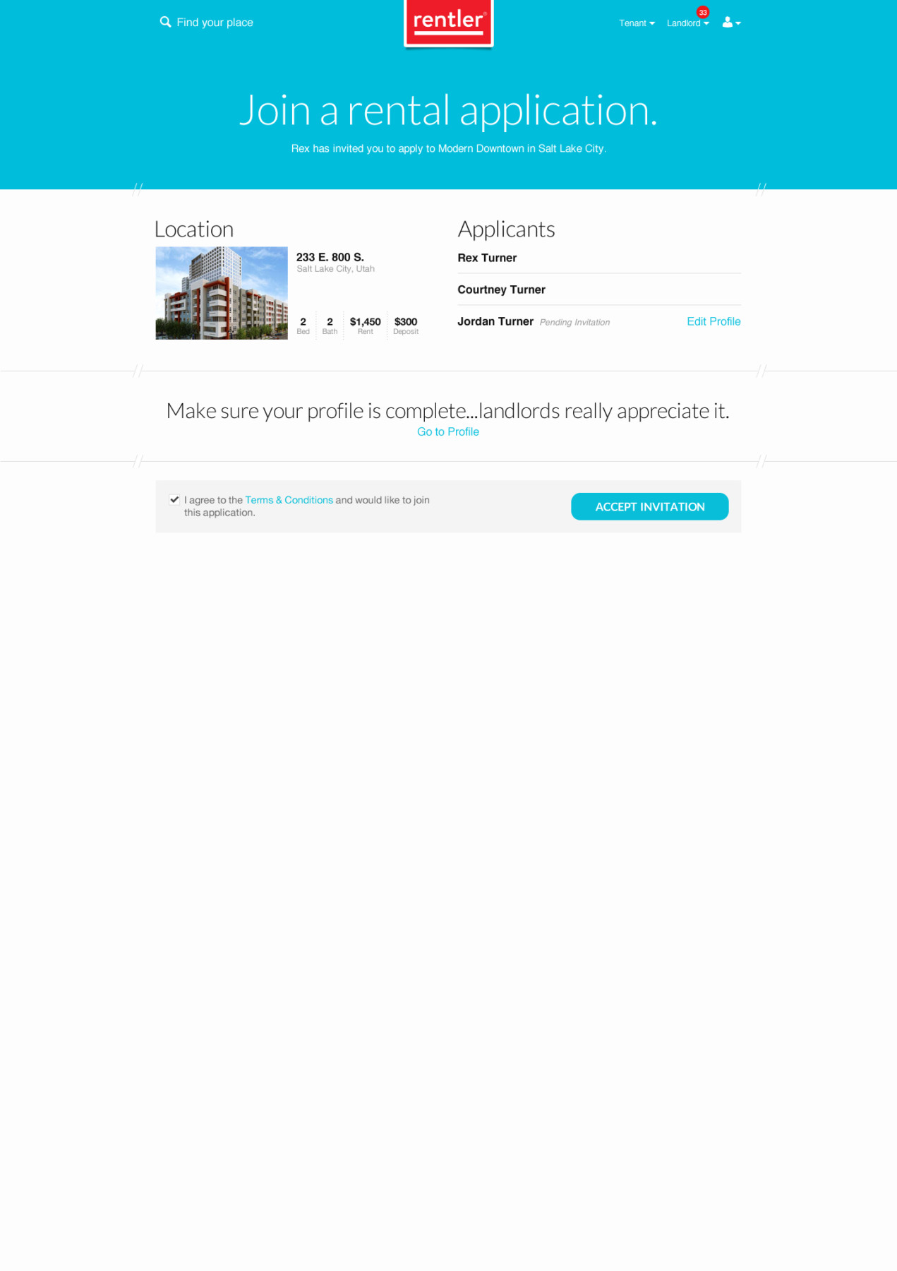
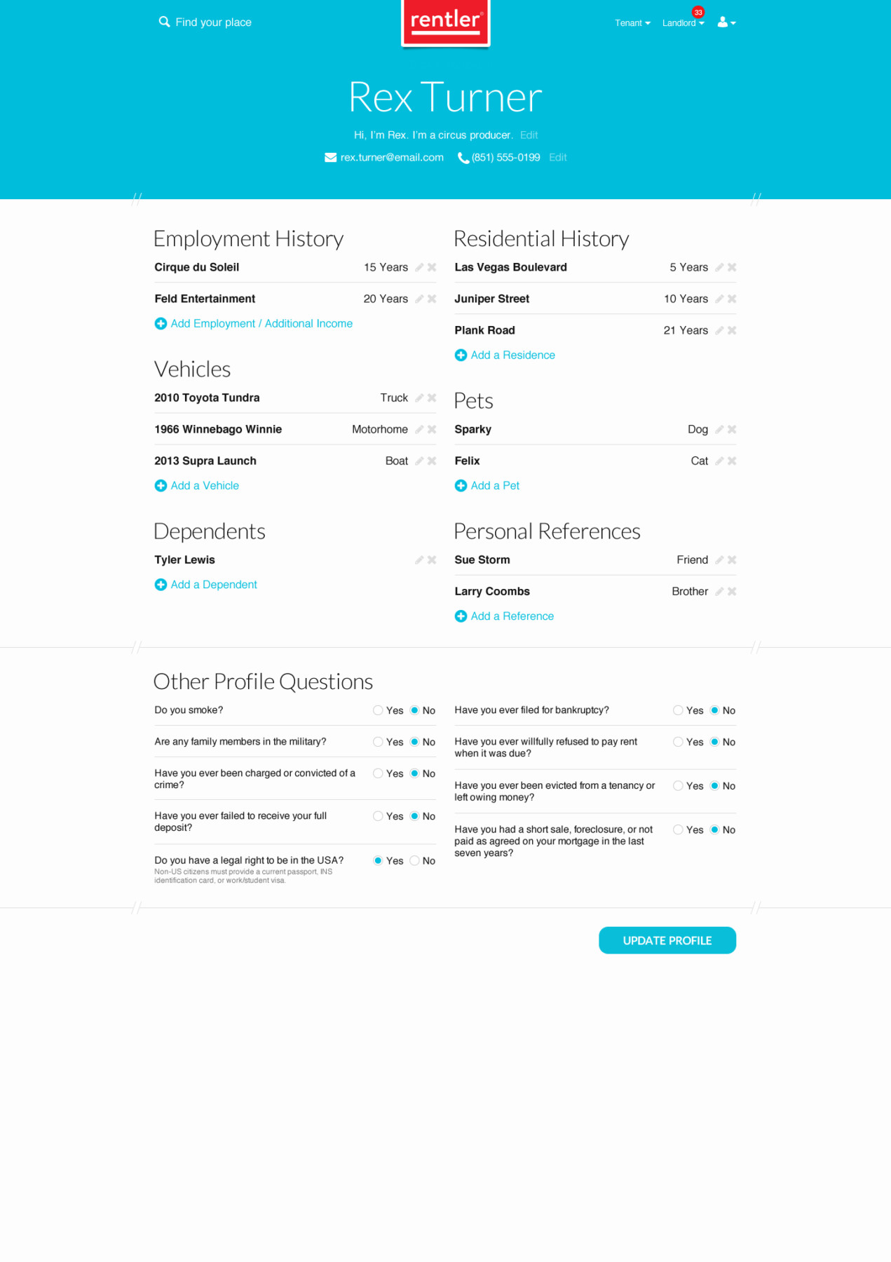
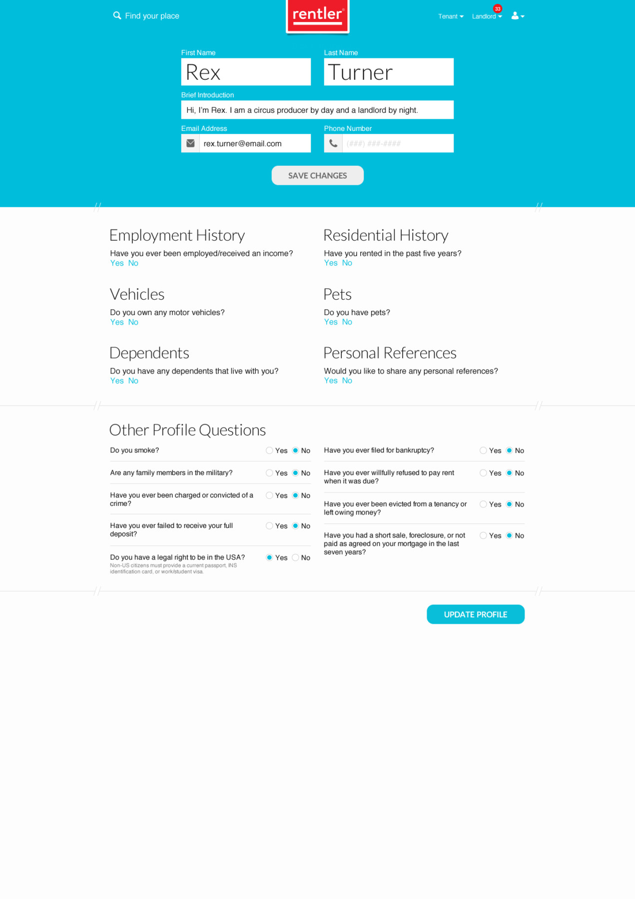
1. Tenant-Facing Experience
- Goal: Design an intuitive and easy-to-follow rental application process for tenants, from start to finish.
- Solution:
- 2016 Design: The updated tenant interface features a streamlined, step-by-step application process, including progress indicators and form field validation. This made filling out the application more manageable and transparent, reducing confusion for tenants.
- 2014 Design: The original design, while functional, had less visual clarity and fewer elements to guide users through the process. It lacked the streamlined flow and ease-of-use improvements that were introduced in the 2016 update.
- Outcome: The 2016 design was more visually appealing, intuitive, and easier to navigate, resulting in fewer user errors and increased completion rates for tenants.
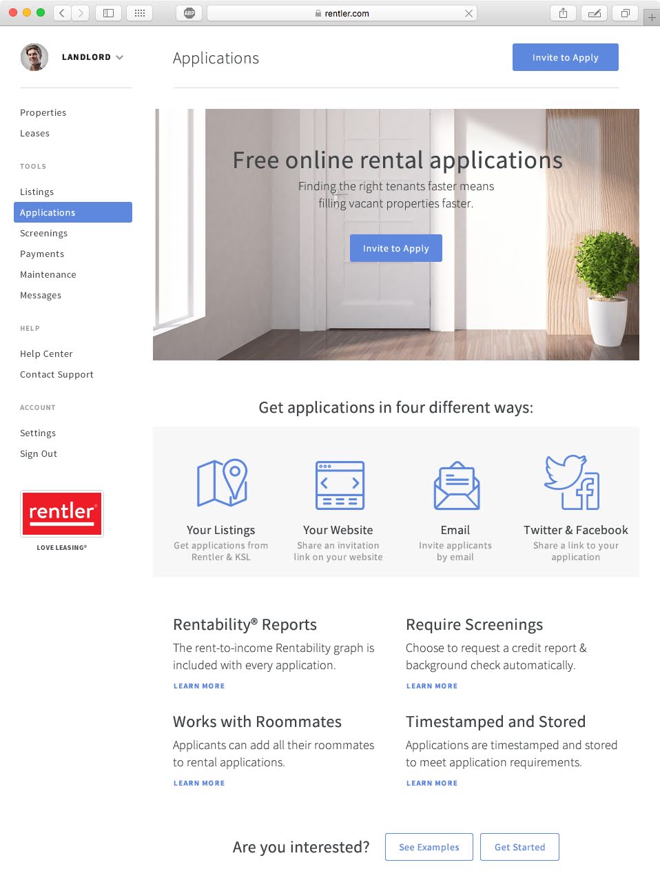
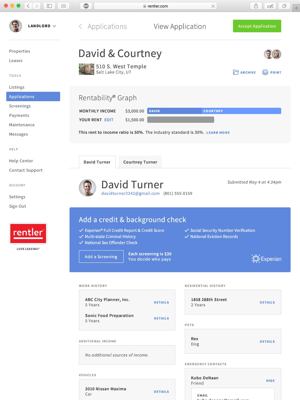
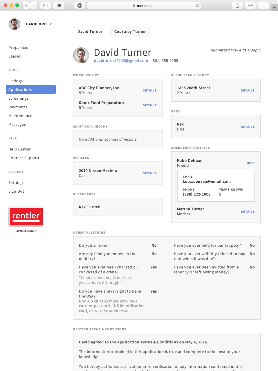
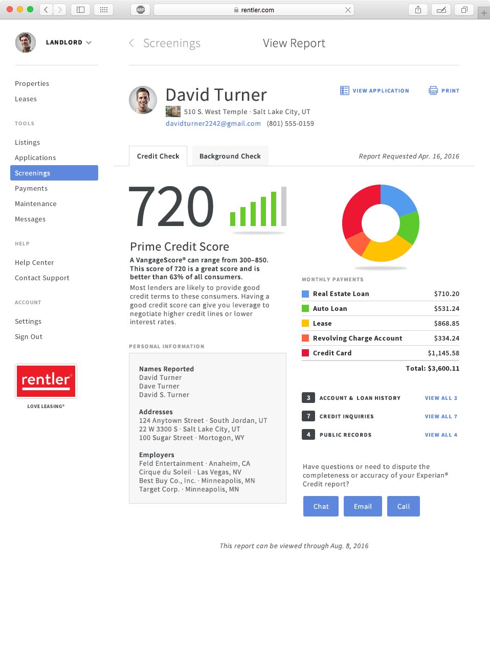
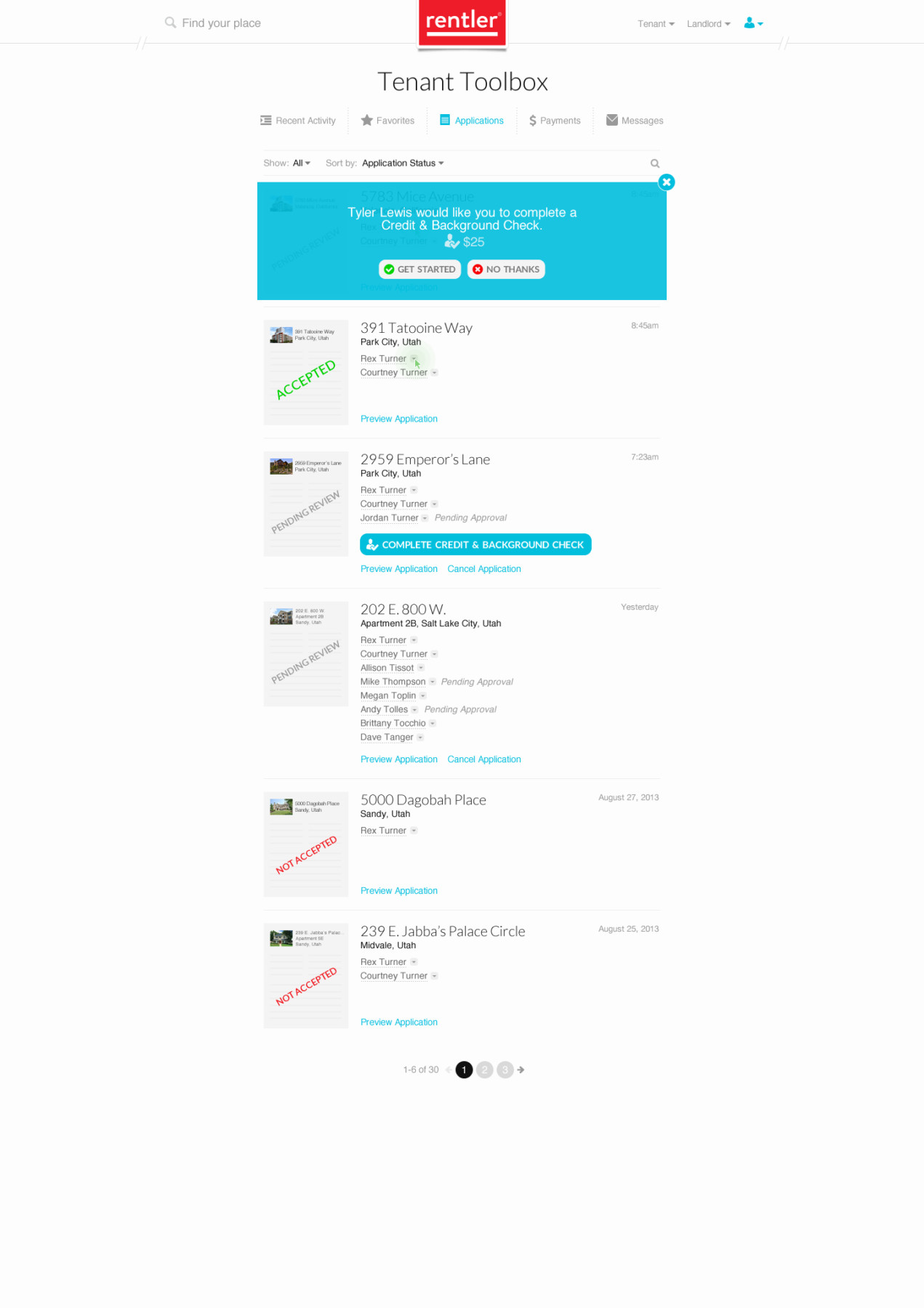
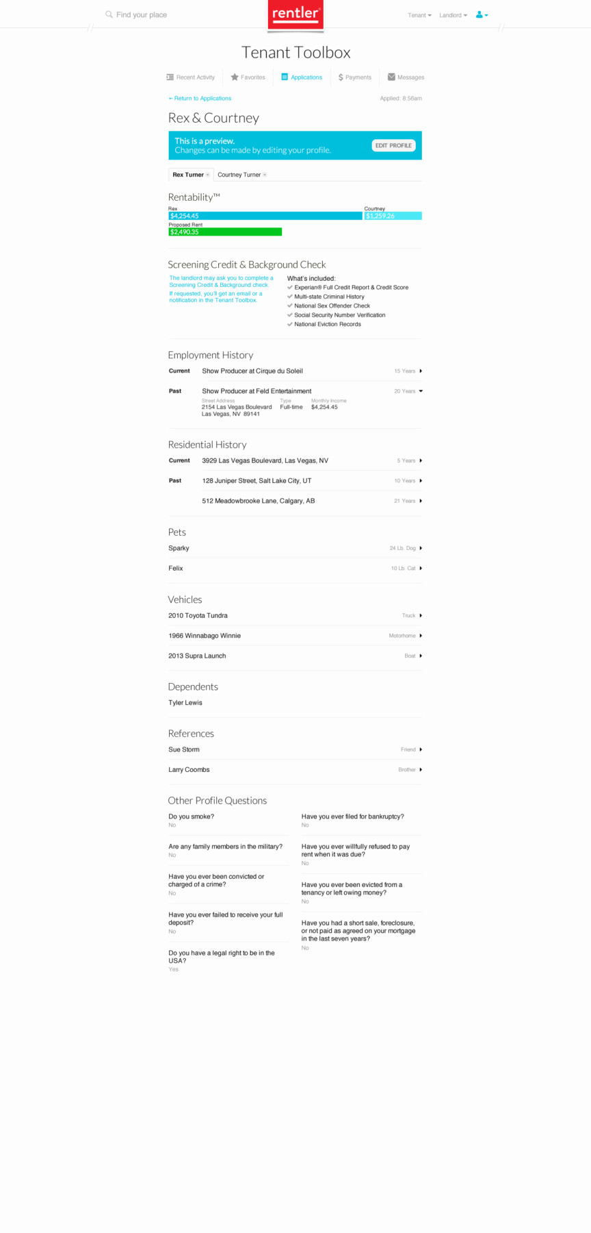
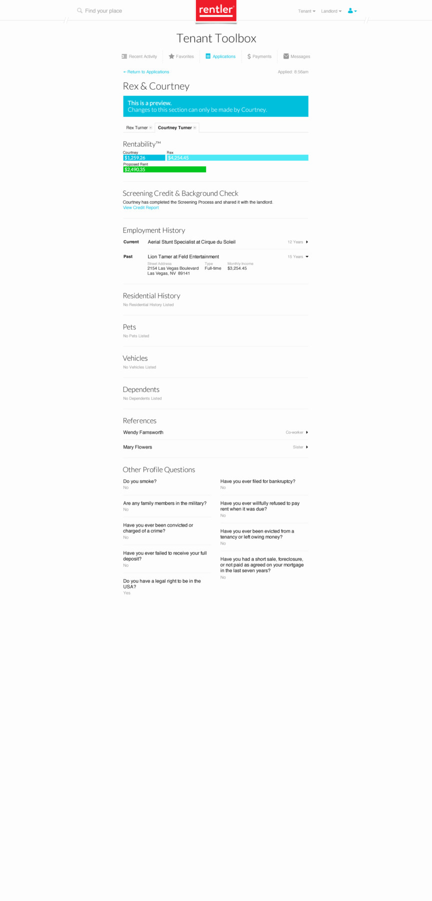
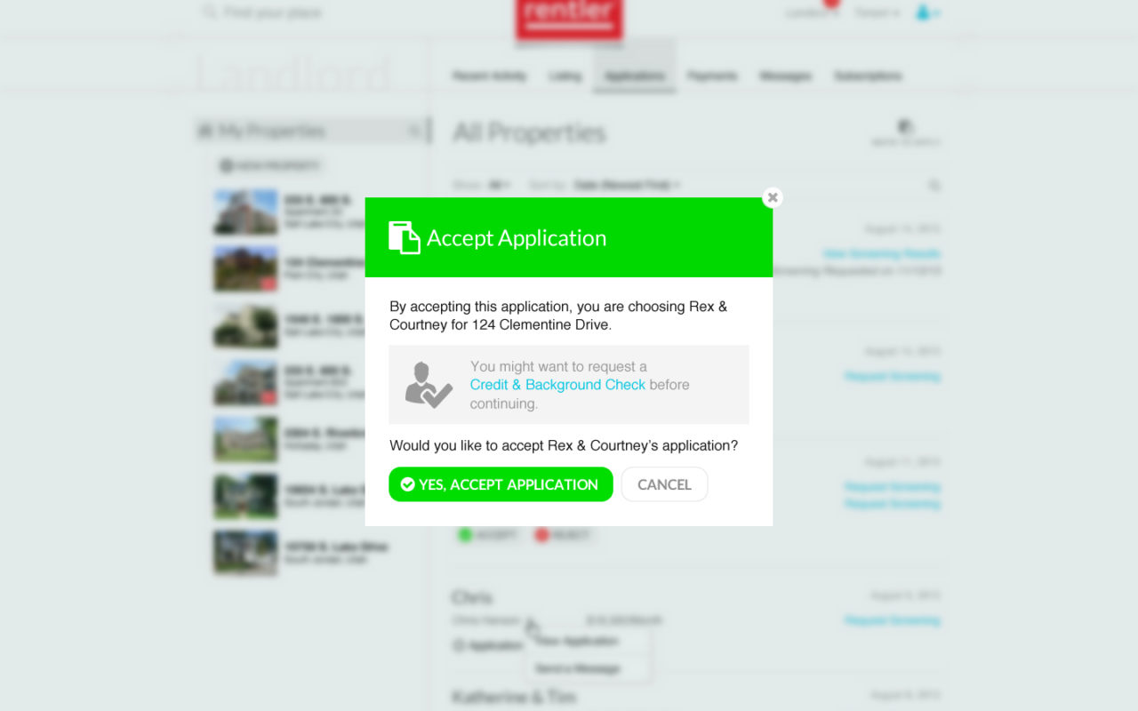
2. Landlord-Facing Experience
- Goal: Create an efficient platform for landlords to review applications, with all necessary information displayed clearly and in an organized manner.
- Solution:
- 2016 Design: Landlords could view all tenant applications in one place, with easy-to-read sections for personal information, application details, and uploaded documents. We incorporated a filtering system that allowed landlords to sort and quickly compare applicants.
- 2014 Design: The older design lacked some of the organizational features that made the review process easier. The interface was less intuitive, making it more difficult for landlords to find specific information quickly.
- Outcome: The 2016 design improved the landlord experience by offering a more organized and efficient review process, ultimately speeding up decisions and enhancing the overall workflow.
3. Usability Testing
- Goal: Ensure that both the tenant and landlord experiences were intuitive, easy to navigate, and efficient.
- Solution:
- We conducted usability tests with real users to evaluate how well the new designs were received. Both tenants and landlords provided feedback that led to minor adjustments for improved clarity, such as the addition of helpful tooltips and clearer instructions.
- The 2014 style was also tested, which helped us highlight the key areas of improvement in the 2016 iteration.
- Outcome: The 2016 design outperformed the 2014 design in terms of ease of use, with significantly fewer user complaints and higher user satisfaction scores.
Results & Impact
✅ Increased Application Completion: The intuitive, step-by-step process and progress indicators in the 2016 design led to a noticeable increase in completed applications from tenants.
✅ Efficiency for Landlords: Landlords reported that the new system saved time by allowing them to easily organize and filter applications, leading to faster response times and a smoother decision-making process.
✅ Improved User Satisfaction: Feedback from both tenants and landlords highlighted the 2016 design’s user-friendly nature, with a significant improvement in satisfaction scores over the 2014 design.
✅ Streamlined Information Architecture: The new system created a seamless experience by reducing the complexity of the application process for both tenants and landlords.
✅ Brand Alignment: The 2016 design aligned with Rentler’s evolving brand identity, creating a modern, clean, and professional look that matched the company’s goals.
Key Takeaways
✔ User-Centered Design: By focusing on the needs of both tenants and landlords, we were able to create a system that simplified the rental application process, making it faster and more efficient for everyone involved.
✔ Iterative Design Process: The project benefited from continuous feedback and usability testing, which helped refine the product and ensure that both user groups had an optimal experience.
✔ Brand Consistency: The updated design ensured that the user interface was consistent with Rentler’s evolving visual identity, helping to create a cohesive brand experience across all touchpoints.
✔ Optimized User Flow: The new tenant and landlord interfaces streamlined the overall process, reducing friction and ultimately driving higher engagement from both parties.