Rentler · 2013–2016
Choosing What Rentler Landlords Needed First
Research informed tools for screening, rent collection, and maintenance.
- Starting Point
- Rentler’s listings appeared on KSL Classifieds, a Utah-based online marketplace for local listings. We wanted to help people apply for and manage rentals, too.
- Design Decision
- Use renter and landlord research to prioritize the handoffs in applications, screening, payments, and maintenance.
- What Changed
- Rentler supported more of the rental lifecycle in one product, with dedicated tools on both sides of the marketplace.
- My role
- Product Design / UX Manager, then Creative Director Led product research and design, then took on the broader experience of how renters and landlords found, understood, and used the marketplace.
- People involved
- Renters, landlords, Product and Engineering
See Both Sides
Renter. Find a rental, submit an application, and pay rent online.
 Two-sided marketplace
Renters
- Find a place
- Apply
- Pay rent
Landlords
- List a property
- Screen applicants
- Manage the rental
The handoff happens at the application. Renters submit their details and landlords review them.
In This Case
Make the Application Handoff Clear
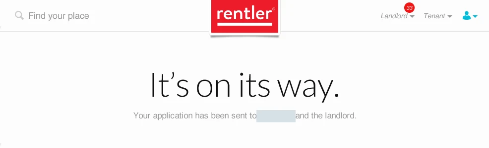
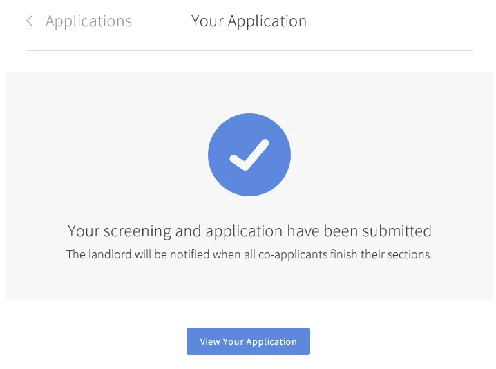
Testing with renters and landlords showed where the application needed clearer instructions. One moment mattered especially in a shared application. A renter could finish their part while someone else still had work to do. I updated the confirmation to explain when the landlord would hear from Rentler.
Beyond the Listing
Rentler already helped people find a rental. Once a listing was live, landlords still needed to screen applicants, collect rent, and follow up on maintenance. Renters needed a clear way to apply and understand what happened next. Every step asked something different of the two sides, so we had to design the handoff as carefully as the screens.
I introduced structured research into the product work, led interviews and usability testing, and worked with the founders, Product, and Engineering on priorities and implementation. I was hands-on in the flows, prototypes, and visual redesign across web and mobile.
My role was to make the research concrete enough for the team to act on. I turned landlord interviews into proofs of concept, then used task-based sessions to see where someone hesitated or looked for information. Product and Engineering helped turn those decisions into a suite that fit the marketplace people already used.
Show What’s Left Before Publishing
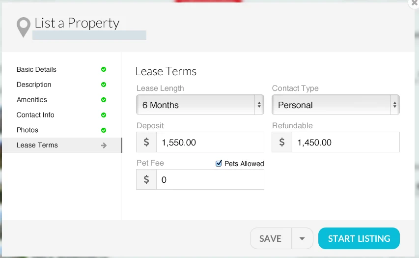
The earlier listing prototype grouped the setup work into sections such as amenities, photos, and lease terms. A checklist gave landlords a way to see what they had completed and return to the part that still needed attention.
From Classifieds to Map-Based Search
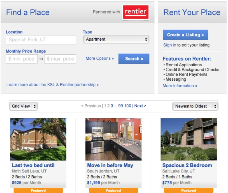
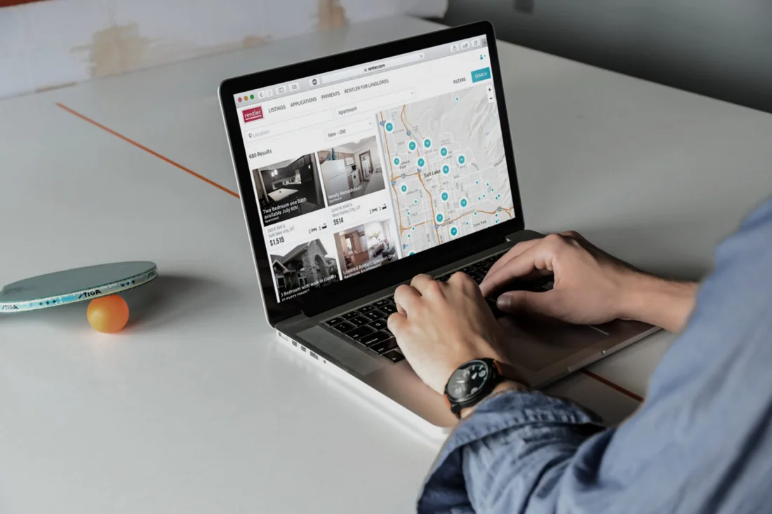
Before the landlord tools, Rentler’s listings appeared in the rental section of KSL Classifieds. I led design for an experience on Rentler.com that let renters explore listings on a map, refine results with filters, and save searches. I interviewed renters, surveyed landlords, and tested early prototypes with both audiences.
KSL already offered familiar filters and a grid. We kept a path from those listings into Rentler, where the map became part of how people compared locations. That experience gave us a starting point for applications, payments, and property management.
From Discovery to a Rental Workflow
Find a Listing
A renter could start in KSL Classifieds and continue to Rentler.
Compare Places
Map and list views let renters assess location alongside listing details.
Take the Next Step
The marketplace could support applying, paying rent, and following up after move-in.
Let Landlords Show Us the Work
I interviewed landlords in Utah about the work that followed a listing and built proofs of concept around the needs they described. In usability sessions, we asked people to work through specific tasks, including submitting an application, tracking a payment, and managing a maintenance request.
The research helped us focus the suite on screening, payments, and maintenance. We refined prototypes as we saw where people needed clearer guidance or a better place to find information. When we tested the rental application with both audiences, feedback led to more explicit instructions and contextual tooltips.
“I love Beau’s openness to trying new things, taking on different roles as needed, and working with the team to produce a product that he feels proud of.”
Redesign the Handoff
Renters needed guidance through a long application. Landlords needed to compare submissions without piecing together details from separate places. I designed the 2016 update around those two jobs.
Earlier Prototype
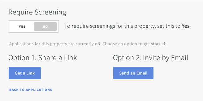
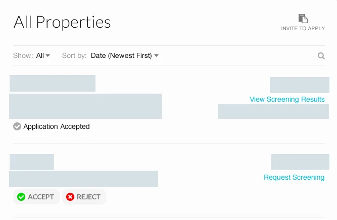
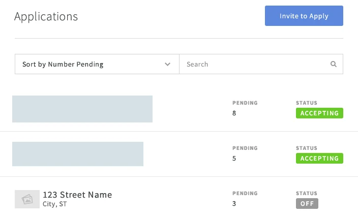
Renters could add co-applicants and send a shared application. Landlords had an all-properties queue with sorting, a search icon, and screening actions.
2016 Redesign
Renters got more guidance through the application, including progress indicators and field validation. Landlords could see which properties had pending work and review application details and uploaded documents together.
Design for Waiting and Recovery
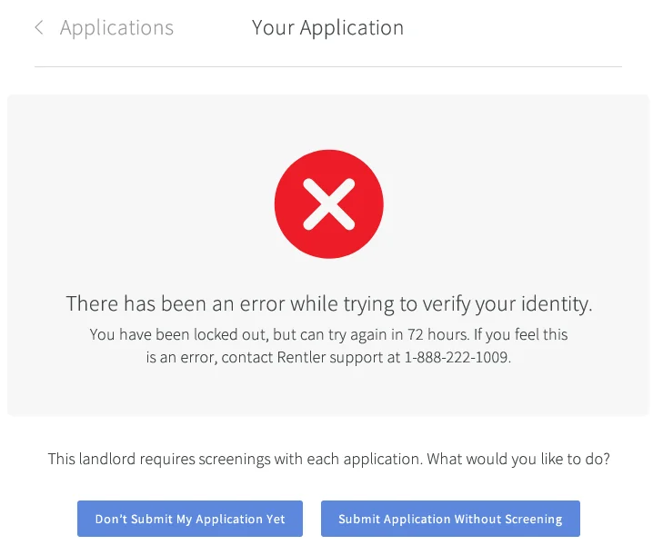
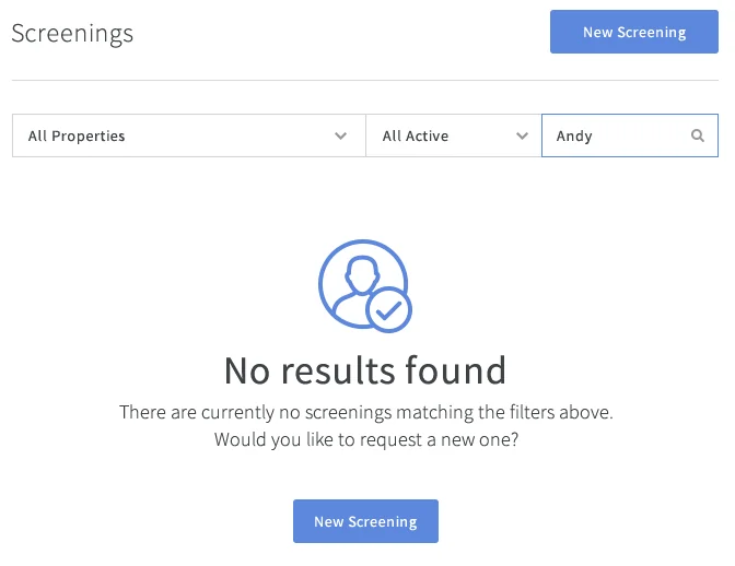
When an identity check failed, the renter could wait and try again or submit without screening. When a landlord’s filters returned no matching screenings, the dashboard explained the result and offered a way to start a new one.
Make It Work After Move-In
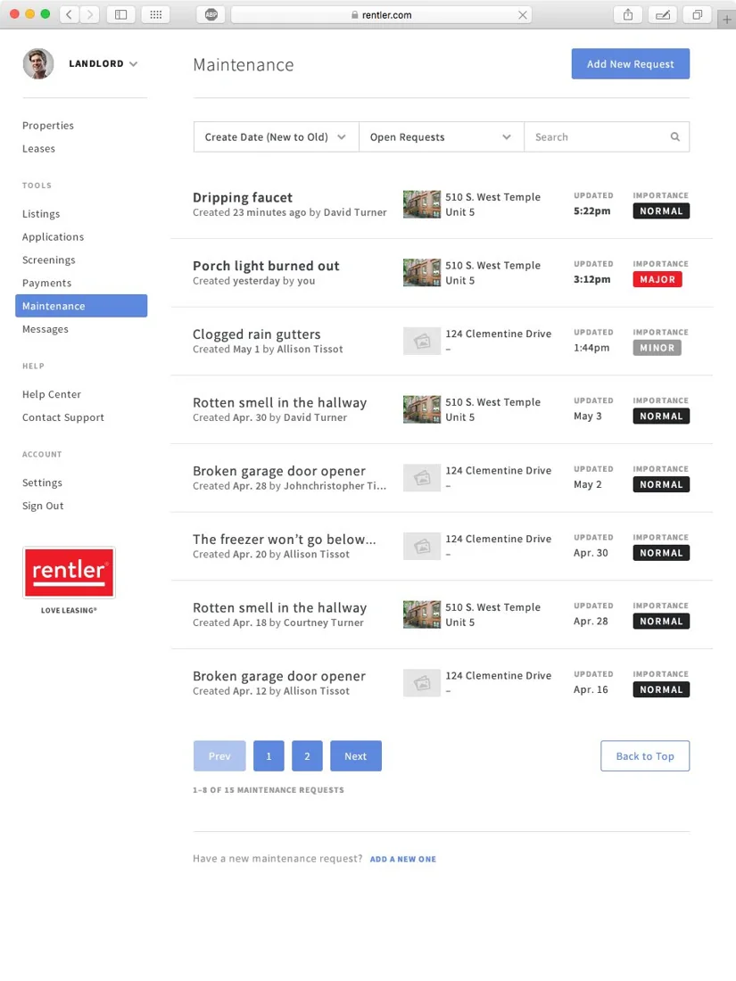
The suite extended the same approach into tenancy. Landlords could track rent activity, and tenants had a place to make payments and review their history. Maintenance requests got a dedicated workspace where landlords could see and follow up on tickets.
Confirm the Schedule on Both Sides
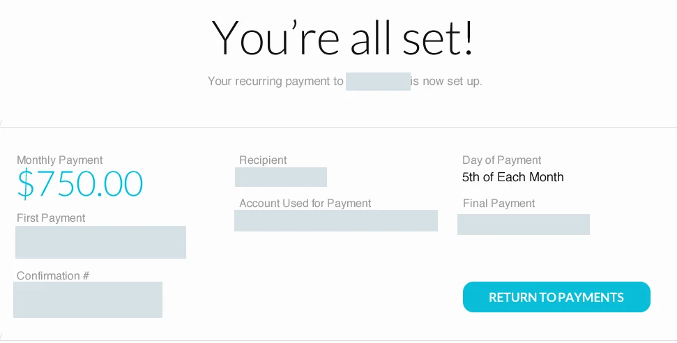
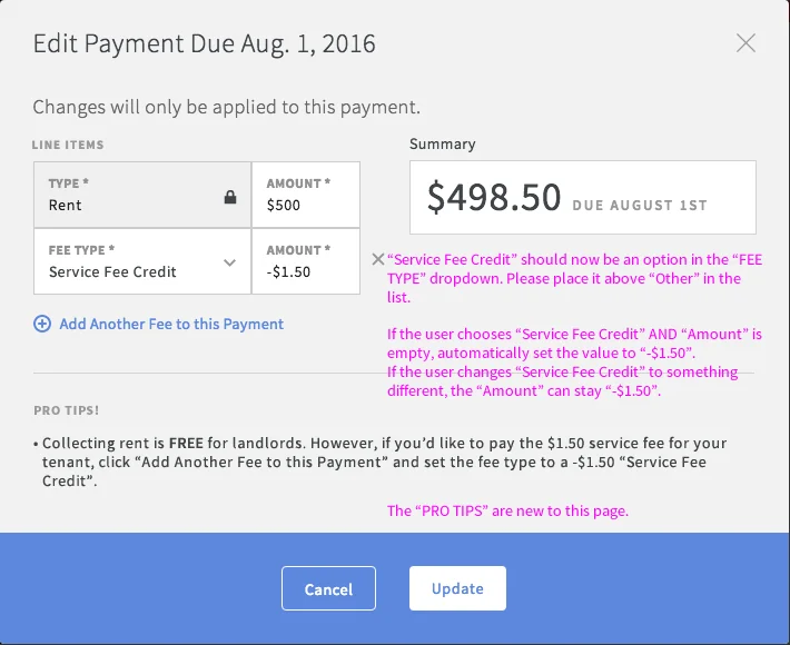
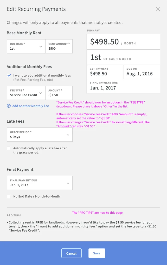
In the earlier renter prototype, the confirmation put the monthly amount and payment timing together after setup. On the landlord side, the edit screens below made clear whether a change would affect one payment or a future schedule.
The payment mockups show how I made the scope of an edit explicit. One screen applied the change to a single payment. The other applied it to future payments that hadn’t been created yet. Both showed the updated amount before saving. My annotations specified when to prefill the service-fee credit so the landlord could cover the tenant’s fee.
Product and Engineering helped integrate these tools into the marketplace people already used for listings. The design work included fitting each workflow into the shared product language across web and mobile.
What Changed
Rentler brought listings, applications, screening, payment tracking, and maintenance into one product. The published application case reports improved completion and positive feedback from landlords who could sort and review applications more efficiently. It gives a qualitative account of those results.
The design principle I’d carry forward is to evaluate a handoff from both ends. A clearer submission flow helps the renter finish and gives the landlord better information to act on.
If I were evaluating the flow today, I’d pair renter completion with a landlord measure such as time to find the right application or the need to request missing details. Measuring both sides would show whether we made the handoff easier as a whole.